Table of Contents
LG GD900 Crystal
Introduction
When it hit the markets in mid-2009, the LG GD900 Crystal was an innovative purchase. In the very crowded cell phone market of its era, the GD900 Crystal set itself apart with its one-of-a-kind design-the world’s first transparent touchpad-from an emphasis on aesthetics to one on functionality; the phone literally broke all design conventions. However, the GD900 featured many awe-inspiring attributes that made it attractive to the tech-savvy and fashion-conscious crowd.
This review will discuss the various aspects of the LG GD900 Crystal, such as the design, hardware, software, user interface, and overall market impact. We would also try to compare it with other devices which were in vogue during the same time and analyze its legacy in mobile technology.
Design and Build Quality
1. Aesthetic Appeal
One of the more distinct features of the LG GD900 Crystal was its transparent slide-out keypad, that is an actual touchpad, kinda. The keypad, made from tempered glass, glowed with a soft blue light, and it just lends elegance to it , like a more futuristic feel for the phone. When this keypad was not in use, it basically merged with the sleek lines of the phone to create a visually interesting effect that, honestly, hadn’t really been seen on the market yet.
About the design itself though, it leaned minimalist and modern, with a smooth glossy finish and a slim profile. The body was built with premium materials, plus metal accents that add to its prestige. But the real beauty of the GD900 Crystal was in the small details: glass, metal, and plastic in a sort of perfect harmony, to attract the target user where style was as important as function, you know.
Build Quality:
There was a great build quality to the LG GD900 Crystal. It never felt fragile or otherwise inferior in hand despite its delicate looks. The keypad sliding was smooth and tight: no wobble, no play; very much a sign of LG’s effort in ensuring the durability of this unique feature. The glass touchpad was actually tempered, and therefore resistant to scratches and minor impact, but it remained one element that the user would need to treat with care.
The phones dimensions were kind of compact, 105 x 52.5 x 13.5 mm, and it weighed 127 grams, so the GD900 Crystal could be carried around in a pocket or in those small tote bags pretty easy. The feel in the overall design was also really nice; rounded edges ,and a slim silhouette made it seem better to hold for longer periods, without much bother.
3. Display:
LG GD900 Crystal provided a 3.0-inch TFT capacitive touchscreen with a resolution to 480 x 800 to be around the 267 PPI mark. At the time, it was a nearly high-resolution display, offering sharp visuals. Being a 16 million color display, it ensured striking and spot-on color reproduction.
It posited itself as the best display on this phone. Clean fonts and images were rendered perfectly, sufficiently telling us that it was very nice, responsive from the touch, and supported multi-touch input. Interacting with the screen was an absolute delight, but in the present day, its 3-inch display could be labeled small.
4. Keypad:
The transparent touchpad was a star for GD900 Crystal. This keypad was more than a pretty sight as far as looks went-it was very useful. The touchpad accepted gestures like those used in laptop trackpads to move around the phone interface, scroll down the menu, and zoom in on pictures by pinch gestures. The keypad also recognized handwriting, which offered yet another way to enter text.
The keypad backlighting was given by a soft blue glow, so visibility stayed good in darker situations, and it also gave the whole device a bit more aesthetic charm. The touchscreen sensitivity could likewise be adjusted, enabling the user to tune it to their personal preference. Even if the idea was innovative, the touchpad did come with some learning phase, and at times it could feel a little less instinctive than having a straightforward physical keypad, or a totally touchscreen based interface.
Hardware and Performance
1. Processor and Memory:
In terms of the inner workings, the LG GD900 Crystal was powered by a Qualcomm MSM7200A chipset that had a 528 MHz ARM11 processor and an Adreno 130 GPU. Said hardware was typical among mid- to high-end smartphones of the time and was sufficient in providing the required hit for most tasks.
With 1.5 GB of internal storage, the phone was expandable with a microSD card slot supporting cards up to 32 GB. It also had 128 MB of RAM, which, in today’s world, might be considered paltry but was sufficient for running the phone’s OS and applications relatively smoothly.
Performance-wise, the GD900 Crystal was well up to most tasks but certainly not a beast. It could manage running basic apps, multimedia playback, and primary multitasking without much lag. It would slow under heavy applications load or intense multitasking and stutter every now and then.
2. Connectivity:
The LG GD900 Crystal had a bunch of ways to connect to stuff. In the mix there was 3G HSDPA , also Wi-Fi 802.11 b/g, Bluetooth 2.1 A2DP, and USB 2.0. Honestly these were pretty much top-tier parts you’d expect in a high end phone back then, so people could remain connected, share data without much hassle, and get on with other day to day tasks pretty smoothly.
With Wi-Fi, it was kind of all about convenience , users could visit websites or pull down whatever they wanted without chewing up that limited mobile data allowance. Bluetooth made it simpler to pair with wireless headsets, little speakers, and other gadgets. And the USB option could be used for moving files between the handset and a computer, pretty straightforward really.
Besides, GPS was supported by the gadget, as was A-GPS functionality, beneficial for navigating and offering location-based services. Still, in comparison with present-day devices, the GPS was quite average in performance, with slower lock-on times.
3. Camera:
One of the truly classy features of the LG GD900 Crystal was its 8-megapixel rear camera; an actual smartphone camera of higher resolution back then. It came equipped with autofocus, LED flash, geo-tagging, face detection, and image stabilization.
At a time when daylight offered everything that the quality of camera could have desired in a smartphone, the GD900 Crystal did very well indeed to deliver bright photos with solid details and accurate color rendition. However, under ambient lighting, it was hard for the LG GD900 to shine. It suffered from a whole lot of noise, which greatly reduced the sharpness and level of detail. The LED flash, of course, aided a little in low-light situations; however, its range was quite limited.
The camera also facilitated video recording at full WVGA resolution (800 x 480 pixels) at 30 fps. For its time, the video was good enough, albeit not comparable to real video cameras. The camera application included tons of shooting modes and options to customize the user photography experience.
Another drawback was the lack of a front-facing camera, making the phone less compelling for video calling and selfies—both of which were gaining popularity at the decade.
4. Battery Life:
A 1000 mAh Li-Ion battery powered the LG GD900 Crystal, making it rather small in comparison to some of its competitors. With medium use, the battery life was sufficient enough to last a whole day on a charge under most normal circumstances. The life of the battery, however, could be diminished under heavy usage instances like prolonged web browsing, gaming, and video playback, which then would require a recharging midway through the day.
The usual power-management features were present to allow for screen brightness adjustments and to be able to switch off wireless connectivity when not needed for saving battery. In addition to that, the battery was removable, meaning that users could carry a spare battery for extended use when there is no way of recharging.
Software and User Interface
1. Operating System:
LG GD900 Crystal utilized the proprietory user interface by LG known as S-Class UI over a version of Symbian OS. The aim of the S-Class UI was to give a strikingly attractive and easy-to-use view with an interface comprising a 3D cube layout where the user can swipe left or right from one home screen to another.
The S-Class UI had 4 customizable home screens; each screen would be set for a different function: contacts, multimedia, widgets, and shortcuts. This way, the user could easily access whichever application or feature they frequently use. The 3D Cube interface design was aesthetically pleasing, but it would lag occasionally, especially at times of faster screen switching with multiple widgets or apps running at the background.
It had in-built applications like browsers, email clients, media players, and organizing tools. While the selection of apps was good, it was nowhere near a bigger world with apps for iOS or Android. The phone did not have anything like an app store either, which greatly limited its ability to grow from third-party capabilities.
2. Touchpad Functionality:
The transparent touchpad was embedded into the S-Class UI for interaction with the phone. Users can use the touchpad to poke through menus, slide across lists, and do multi touch movements like pinch to zoom. The touchpad also had a handwriting recognition feature, so text input was possible by drawing characters right on the pad, like you know, writing it out.
The touchpad provided interaction on a different level, unlike most contemporary phones. On the opposite side, it also required the user to shift gears into a new way of interacting with a phone. This could pose a challenge for those struggling to navigate away from keypads or touchscreens with which they have been familiar all this time.
One nifty feature of the touchpad was on the media and camera side. Controlling volume, skipping tracks, zooming in, and out while taking photos/videos were all possible through the touchpad. This made the touchpad more than just an entertaining gimmick; it actually contributed significantly to the user experience. Yet, the users did not universally accept it. Some found it awkward particularly for fine-grained tasks, while others missed the tactile feedback of pressing real buttons. In fact, the touchpad required quite some effort to become proficient, and many found it to be the hindrance in the beginning.
3. Customization and Widgets:
The S-Class UI gave a fair bit of customization. This was good, especially for those who enjoyed making their devices look and feel just a little bit iterated by their own touch. Users could set up any of the four home screens with a collection of widgets, shortcuts, or backgrounds. Widgets delivered bits of information such as weather status, calendar event reminders, and Facebook feeds. Meanwhile, shortcuts would lead to hits of an application or function most often used.
Also, the UI featured a task manager for switching operations in and closing applications, which was useful in freeing up limited phone resources and bettering the overall performance.
Still, when compared with a level of customization on modern smartphones, this was quite limited. The widgets on offer were rather few, and one could not simply download anymore from some app store. Also, the S-Class UI did not provide for a deeper level of customization available on the more open platforms such as Android.
4. Multimedia Experience:
The LG GD900 Crystal was pretty multimedia focused , so it basically shipped with a capable media player that handled quite a few audio and video formats. The music player itself was pretty basic , so most people found it straightforward to walk through their music library by artist , album , genre, or even playlist. It also had album art, and overall it sounded solid, especially when using decent quality headphones.
The player was quite capable. Yet, with a 3.0-inch screen, extended video times were less desirable. Color reproduction and resolution were superb for quick video snippets, although the bigger screens found on competing devices were far more immersive.
The standout feature here was the phone’s ability to output its video to a larger TV screen, albeit requiring an adapter. This was sweet for couples and the occasional few who wanted to watch their media together, but the external adapter need was somewhat of a downer.
The phone also had an FM radio that supported RDS. This was a handy little bonus for users who wanted to listen to live broadcasts. The radio app was easy to use and allowed one to save stations as favorites, and the display would show song information whenever it was available.
User Experience
1. Call Quality & Messaging:
The LG GD900 Crystal performed well in comparison with basic phone functions like calling and messaging. Call quality was generally quite good with clear audio from both ends of the conversation. With the use of the noise-cancellation technology, background noise would be lowered so calls could remain clear during a chat even in a loud environment.
Messaging on the GD900 Crystal was pretty straightforward. It allowed for SMS, MMS, and emailing options for which a built-in email client supporting multiple accounts was available. The messaging interface was fairly easy to use and, though the keyboard wasn’t as big or responsive as those found in today’s smartphones, it was good enough to type messages on. Alternatively, text could also be entered through handwriting recognition on the touchpad, which many people found to be somewhat useful; less so for most of them, however, since it was slower than just typing.
2. Web Browsing:
Browsing the web on the GD900 Crystal was an average experience for its time but that fell short of the kind of experience offered by more modern smartphones. It carried with it a full-fledged browser that would flex some extent by supporting HTML and JavaScript of the most basic kind, though, far behind in terms of speed and sophistication, the likes of which could be found on devices like iPhone or Android lately.
The 3.0-inch screen was fine with web browsing, however, a lot of scrolling and zooming had to be done on the websites. Scrolling could also be accomplished through the touchpad, which was a rare feature, but the overall usability was constrained due to the phone’s processing power and the limitations of its browser.
Furthermore, no Flash support rendered many websites poorly, which was a problem common to several mobile browsers back then. It could be described as good only for the beginning stages of internet use and not one that could do the heavy lifting.
3. Gaming:
Gaming on the LG GD900 Crystal was a kind of bittersweet experience. The phone could accommodate basic games along with those pre-installed or downloaded from LG’s scarce app ecosystem. Mostly 2D and easy ones, these games did not really require flower graphics or processor speed.
The GD900 Crystal, however, was never really built to be a gaming phone. Because of the lack of a dedicated app store, options for downloading games were quite limited. And the transparent touchpad, though intriguing, was a sore point in the gaming arena because it didn’t feel quite right compared to physical buttons-they attracted a certain section of people while the other option-the Sony Ericsson Xperia Play-was made with gaming in mind.
For casual-minded gamers, this phone was enough; however, anyone seeking more sophisticated and immersive gaming experiences was bound to be left disappointed.
4. Social Media and Apps:
In view of the period’s landscape for software and applications, social media access from the GD900 Crystal was limited. Although technically, there was the possibility to browse through social sites via its web browser, the experience was far from smooth or user-friendly, much unlike modern smartphones equipped with dedicated apps.
There were no pre-installed apps for such popular social networking sites as Facebook or Twitter, though users could always log onto the sites via the browser. Having a limited app ecosystem constituted one of the primary impositions since it failed to keep pace with the ever-rapidly changing landscape of mobile apps.
The GD900 Crystal did come with some useful apps for personal and utility purposes like the organizer, calculator, and voice memo recorder. However, the array of apps was rather limited in contrast to more open platforms, which made the phone less versatile for those who liked to have a variety of apps and services at their fingertips.
Market Impact and Legacy
1. The Reception:
There were mixed reviews for the LG GD900 Crystal when first launched. It gained praise for its groundbreaking design by many that saw transparent touchpads as a big and futuristic leap by LG in their design innovation. Great praises were showered on it by the design critics for its stylish and modern appearance, making it somewhat attractive for fashion-conscious consumers.
The GD900 Crystal, however, found itself being criticized for its tame software experience and almost nonexistent app ecosystem. While it had impressive hardware, the operating system and user interface left an inferior mark compared to that of the iPhone that was giving a more well-rounded and friendlier application environment to its users.
The price of the phone was another source of disagreement, since it placed the GD900 Crystal as a premium phone, but many thought that the features and performance did not quite justify the price. Due largely to this, the GD900 Crystal could never hope to achieve very broad appeal, especially in markets where cheaper phones offered more features.
2. Competition:
The LG GD900 Crystal found itself amid too much competition from phones launched around the same period. The main competitor was definitely the iPhone 3GS, which had a more intuitive user interface, a good app store, and superior overall performance. The success of the iPhone indeed emphasized the importance of software and ecosystem, areas in which the GD900 Crystal was light years behind.
Other competitors were Nokia N97 and Sony Ericsson Xperia series, both boasting good hardware and more established software platforms. N97 ran on Symbian, which had a larger app library and was more familiar to users of Nokia’s existing smartphones.
Setting it apart from the rest on design was the one major thing that the GD900 Crystal had going for it; however, this was not enough to outshine what the heavier competition offered.
3. Legacy:
The LG GD900 Crystal remains a legacy of innovation and design experimentation. Though it was not a big commercial success, the transparent touchpad was a bold gesture asserting LG’s willingness to push the mobile design boundaries. For those who appreciate unusual and eccentric technology, the GD900 Crystal remains an unforgettable device.
In the subsequent years following the release of GD900 Crystal, transparent and semi-transparent design elements became somewhat of a fashion in consumer electronics, though very few devices went all in like the GD900 Crystal. One can observe the phone’s influence on future LG devices that carried on with their experiments on form factors and materials.
In contrast to these advantages, the GD900 Crystal reminds the industry about the importance of software and ecosystem in the successful deployment of a mobile device. That is to say, while hardware innovation is paramount, it must go hand-in-hand with a strong software experience if it is to truly appeal to the consumer.
Conclusion
LG GD900 Crystal was that phone which dared to be different. Its transparent touchpad and slim looks set it apart in an arena full of ordinary devices. For the aesthetically inclined and adventurous on alternate ways of interacting with their phone, the GD900 Crystal promised a unique experience.
However, although the phone had a limited app ecosystem, an average performance, and a price that could make one grab the hair thin, it would not make it to mainstream mass consciousness. It was a device that would appeal to only a select few, while others would want an altogether more balanced set of traits on their smartphone.
In retrospect, it is great to consider the LG GD900 Crystal as a fragment of mobile history. It stands for a period when manufacturers were still testing form factors and features before the smartphone market was really created. Therefore, while it may not have sold in Kansas City in a hurry, the GD900 Crystal, with both its front and rear movements and slick looks, did well to impress luckless buyers with whom it crossed paths.
Nokia 8800 Arte
Introduction
Release year 2008, the Nokia 8800 kind of hangs out in that luxurious corner of phones, where the look matters as much as the advanced tech. Because it uses high-grade materials, has a far reaching silhouette, and shows extreme attention to detail , the Nokia 8800 Arte stayed as a real symbol of mobile phone luxury. It was made for a niche audience, you know , and it leaned on aesthetics and careful craftsmanship, not on high-tech features that most smartphones back then were loaded with.
In this review, we will dissect the Nokia 8800 Arte, touching upon its look, features, performance, and its very existence before and after the market. We will also reflect on its legacy and see how it fares in the contemporary era of smartphones.
Design and Build Quality
The Nokia 8800 Arte was made to impress— and it did! The design is slick, minimalist, and elegant, forever kind of tied to what is associated with making that luxury sort of product by Nokia. The choice of high grade materials like stainless steel and glass, made the 8800 Arte feel one step above any other phone on the market back then.
1. Materials and Finish:
The Nokia 8800 Arte’s body is stainless steel, making the phone both solid and durable in feel and attacking luxurious appeal. This stainless steel is polished almost to a mirror finish, which, while not really resistant to fingerprints, does contribute to the high-end look of the phone.
A front display of scratch-resistant glass was a key selling point at the time of its release. That glass defense did more than keep the screens free of scuffs, it sort of blended into the whole sleekness of the design. The rear panel is glass too ,so there’s this kind of balance that really elevates the phone’s premium vibe.
The Nokia 8800 Arte arrived in multiple color options, like black and brown, and each one has its own particular allure. This palette selection gave the user the liberty to pick a look that matches their personal preferences.
2. Slider Mechanism:
One of the marvelous features that the Nokia 8800 Arte boasts is its smooth sliding mechanism. With perfect weight and engineering, the sliding action feels very rewarding to open and close-the keypad then gets revealed-a keypad composed of metal that has a satisfying tactile feel, which enhances the overall user interaction.
The slider’s impeccable precision was a testament to Nokia’s eye for detail and focus on quality. It was made for durability so that even after long use, the phone would still feel luxurious.
Besides that, the slider had a unique area that was touch-sensitive, letting users mute incoming calls with just a tap on the surface-an elegant way to add convenience to the user experience.
3. Dimensions and Weight:
Nokia 8800 Arte is a compact phone by today’s standards with dimensions of 109 x 45.6 x 14.6 mm. At 150 grams, it is unexpectedly heavy for such a small-sized phone, but the heft imparts a feeling of quality toward the phone. The weight distribution is also very balanced, making it comfortable to hold for long durations and to use for that matter.
The pocket or purse-friendly size of the 8800 Arte makes it highly portable, while the weight of the phone offers an assuring feeling of build quality and durability.
Display
The Nokia 8800 Arte’s display was a protagonist selling point for the device-at that time. Though relatively small in today’s world, this screen was more than sufficient for what it set out to do.
1. Screen Size and Resolution:
The Nokia 8800 Arte contains an industrio-innovator 2.0-inch OLED display, with a display resolution of 240 x 320 pixels. That’s around 200 pixels per inch. A resolution that may not be great these days but was just enough for its functionality. The OLED screen, then pretty high tech, gave vibrant colors and deep blacks. Back in the day, however, the diminutive screen size told of limited multimedia capabilities but was just enough for the most basic things: texting, calling, and navigating through the phone menus.
2. Display Quality:
One of the significant features of the Nokia 8800 Arte was its display quality. The OLED panel delivers, kind of good color reproduction and also strong contrast, so the pictures look crisp and vivid on the screen. It felt pretty impressive, honestly, especially when you were looking at photos or just scrolling through menus on the phone.
Another important characteristic was great readability under different scenarios, like in direct sunlight, usually a concern for many in-house phones at that time. This was further bolstered by a scratch-resistant glass brought over the display.
3. User Interface:
The Nokia 8800 Arte UI was plain and progressing along the line of elegance and user-friendliness. The main menu was a grid of several icons, each icon representing a particular function or application.
The interface was easy for anyone to navigate, even if they were not computer savvy. Keypad-wise, the compact size was very responsive and offered enough tactile feedback, helping one to type messages and dial numbers with ease.
Still, the price for that later boon-whether screens bigger or touch functionality-limited usability compared to the forefront of contemporary smartphones. The interface was Lightning-fast and functional for a few basic actions but lacked the ability for enhanced-time interactivity or customization that an average user would expect from contemporary devices.
Performance and Features
Not really a powerhouse device, it was filled with many features that were considered a wow factor at the time. It was built for a smooth and all-around classy user experience and was never supposed to compete with the latest phones in terms of raw performance or functionality.
1. Processor and Memory:
The Nokia 8800 Arte ran on a pretty straightforward ARM 11 processor, which was kind of a regular thing for mobile phones back then. The device came with 128 MB of internal memory storage, but there was no possibility for memory expansion. So it kinda restricted how much stuff users could keep in it. Still, that amount was enough for what the phone needed to handle, in everyday terms.
Its processor could manage the basic, usual chores in a smooth manner, like making calls, sending text messages, and moving around the interface. However, it realistically never was built for performance hungry needs, like gaming sessions or multimedia playback. Also, there was an obvious ceiling on photos, videos, and music files, since the phone had no expandable memory option. That was a minus point, for the smaller group of people who actually wanted to load up on multimedia. The overall worry was basically nothing for the kind of customer base that cared more about luxury touches, and design over raw capacity or speed.
2. Camera:
A 3.15 MP camera with autofocus came with the Nokia 8800 Arte; hence the camera was at par when it came to luxury phones. The camera could take decent photos, especially in overpowering light.
The camera interface was simple and easy to use with option basics to light up from settings such as white balance or exposure. The phone needed more advanced camera features such as a flash, image stabilization, or even a front camera. This is what limited the photography ambitions of the phone.
The camera could of course grab videos, but the quality was not exactly remarkable, especially if one considers present-day expectations. The videos were shot at a resolution of 176 by 144 pixels, which was good for uncasic projects but far from standard for serious video work.
3. Connectivity and Software:
It possessed rather basic connectivity: 2G and 3G network support, Bluetooth, and USB. It was one of those noticeable omissions, Wi-Fi.
It practically meant that users were stuck with cellular data for internet access: a slow option and pretty expensive too, depending on the network. The browser was also bare-bones and slow by today’s standards, good only for a quick search every now and then.
The phone ran on Symbian Series 40, an operating system that was relatively stable and user-friendly but did not have the application ecosystem and customization potential of the more advanced Symbian S60, iOS, or Android platforms.
The software suite offered some rudimentary applications, such as one for calendars, one for calculations, and a music player. But the phone was not meant to be a modern-day smartphone. It was more like a high-end, stylistic feature phone with luxury connotations.
4. Battery Life:
The Nokia 8800 Arte had a battery rated at 1000 mAh capacity, which would be considered very small by present measures but was sufficient for the low power needs of the handset.
The battery life was just about the right amount for typical use, wherein it would last for at least a full day on a single charge, contingent very much on the pattern of use-dependent users. More intensive use of features, however, such as the camera or music player, would have the battery give out much faster.
Another downside was that the battery was not user-removable, a deliberate design choice made to ensure the phone’s slender profile but that gave the buyer no recourse in changing the battery if it degraded with time.
User Experience
The user experience with the Nokia 8800 Arte was really built around its luxury persona, and that top tier material composition. Even though it didnt include a bunch of the things that are basically standard now on current smartphones, it still delivered a kind of rare feel, for a specific kind of user you know.
1. Call quality and messaging:
The call quality on this phone was magnificent, the voices came through clear ,and the reception felt strong. It had been set up well with a capable microphone and speaker, so the 8800 Arte helps users hold crystal clear conversations, even if they end up in noisy surroundings.
Messsaging on the 8800 Arte was rather simple, with the Series 40 OS affording a casual and efficient experience for SMSs and MMSs. The tough keypad was soft to the touch and thus easy for users to type messages although it definitely lacked the speed and convenience of modern touchscreen typing.
2. Luxury Experience and Brand Prestige:
The major selling tool for this Nokia 8800 Arte was that it somehow provided a luxury experience. This phone was bought not for its functions alone but also for the statement it made. A device like this existed for the person who valued exclusivity, impeccably good craftsmanship, and a high-get brand name.
Nokia took care to ensure that all aspects of this phone-from opening the packaging right down to everyday use-reflected an exclusive experience. Then came the packaging to complement the product; it was created using luxurious materials with much attention to details that created an air of exclusivity.
Luxury Accessories for the Ultimate Experience:
3. Daily Usability:
Though it was considered a luxury, the Nokia 8800 Arte was still designed as an understated, everyday phone. Being compact, it fit well in the hand or pocket; while on the other hand, its sturdy construction served in withstanding the rigors-related damages of daily use.
From a contemporary perspective, the device had a small screen and very basic features, quite the contrary to what most smartphone users would require. Web browsing, watching TV, and using apps were greatly constrained by the phone’s hardware and software.
The UI was straightforward and simple to use but lacked depth and customization, which unfortunately have become a norm with newer mobile OS(s). Therefore, in some respects, it was very easy to use but limiting.
So, if all you really cared about was making and receiving phone calls, sending texts, and perhaps conducting some very basic scheduling functions, then the 8800 Arte was definitely good enough for you. However, if you wanted something with more features and flexibility, then you would have certainly found this one lacking.
Market Impact and Reception
The Nokia 8800 Arte was positioned along a broader pattern in the mid-2000s in the mobile industry when luxury phone making was being explored by manufacturers. Such phones were never just about communication; rather, they were about expressing a symbol of status and style. The 8800 Arte was the most successful and well-known luxury phone in its time; thus, it impacted the market on a large scale.
Target Audience:
The Nokia 8800 Arte was clearly aimed at a particular segment— lower-income consumers , for a clientele that cares about style , exclusivity, and brand prestige more than, basically anything else. It wasn’t really meant to go toe-to-toe with the high-tech smartphones of the day, but instead present another option, with a focus on luxury and craftsmanship.
That exorbitantly high price fit in perfectly with the intended audience. It was sold as a high-priced item and every little thing from its design and material choices , to its promotional plan reinforced that whole positioning, almost like it was the point.
Critical Reception:
The Nokia 8800 Arte was generally praised by critics, especially for its seems to have been positively received by most critics for its design and build quality. They commended the phone for its choice of premium materials and elegant aesthetic and attention to fine detailing.
Yet, it lacked the more advanced features that were a drawback against the rising tide of feature-rich and more multifunctional smartphone competitors. 8800 Arte was one among other luxury options which were compared against each other; The one might have gained higher marks for design and craftsmanship but was regarded as faltering in another corner-functionally.
The phone’s price was also another sore spot, as it was not affordable for many potential purchasers. For those who were financially comfortable, however, the 8800 Arte was deemed worthy of an investment, presenting a unique but luxurious experience that was not equaled by any other phone.
3. Sales Performance:
Even with the steep price, the Nokia 8800 Arte became a commercial hit. It found a niche market and was highly sought after within that market. The exclusivity and luxuriousness of the phone gave it prestige in the eyes of the rich, and in markets where luxury goods were appreciated, the 8800 Arte performed really well.
The success of the 8800 Arte put Nokia on the map as a luxury phone manufacturer. It also helped generate a healthier competition with more manufacturers putting out high-end offerings, thus making the concept of a luxury phone increasingly popular.
Legacy and Modern Views
In retrospect, the Nokia 8800 Arte stands as a time in mobile phone history that is quite peculiar. It was very much of the moment: it encapsulated a growing demand for luxury and exclusivity in consumer electronics. While it may not have been able to hold a candle to the modern-day smartphone in terms of features or capability, it did offer a different experience-a nostalgia of sorts with respect to craftsmanship and design.
1- Collectibility:
Currently, the Nokia 8800 Arte is regarded as a collectible, particularly among aficionados of vintage phones. Its novelty as a luxury phone combined with an enticing design and the best materials make for a strong appeal to collectors.
The rarity and very limited production of the phone in itself adds value as an item worth collecting. There is potential for classy specimens of this 8800 Arte to sell for high prices on secondary markets, especially when original packaging and accessories accompany them.
2. Comparison with Modern Smartphones:
Comparing the Nokia 8800 Arte to modern-day smartphones is somewhat unfair, as the phone was probably never meant to compete with the most recent trends. However, it does present an interesting contrast to today’s feature-full devices.
The 8800 Arte puts emphasis on design and manufacturing, a very rare quality nowadays as most manufacturers generally view their phones as gadgets first and consider luxury and exclusivity further down the scale. There is still a market for devices where design stands high, as Vertu’s continuing popularity — means a thing or two for the legacy of luxury phones.
Finally, when it comes to functionality, in comparison to even the simplest of modern smartphones, the 8800 Arte quite clearly doesn’t make a very good case for itself; but then the device is more about being unique in design, premium in materials, and offers an almost vintage sense of exclusivity-it is this trifecta that a certain segment of the market still finds value in.
3. Impact on Nokia and the Industry:
The Nokia 8800 Arte was part of a larger set of transformations in which the mobile phone industry was attempting to open new markets and/or new segments. It established Nokia as a leading entity in the luxury phone market and showed that there was some consumer demand for top-range, design-oriented gadgets.
Since the 8800 gave fame to luxury-type phones, several phone companies took the initiative of designing their own kinds of devices. Samsung, LG, and Motorola were some of the brands that attempted competing design- and luxury-oriented phones, but very few of those phones gained as much fame or success as the 8800 Arte.
For Nokia, the 8800 Arte symbolized the company’s ability to innovate and go after new markets. It was one of the peak instances in Nokia’s history: at a time when it was still the biggest player in the mobile phone domain. However, as the emergence of smartphones began to evolve, Nokia found difficult to hold on to its position, and the interest in luxury phones was way down.
Conclusion
The Nokia 8800 Arte is one distinct device that has earned a different place in mobile phone history. It represents that era when design and craftsmanship were up there alongside technology and features, thus giving a little insight into an older mobile phone design philosophy.
While it lacks the advanced features and capabilities of modern smartphones, it has another sort of value. It is a phone that was designed as a luxury item, and as such became a statement of status and style. A great success in this regard.
Nokia 8800 Arte continues to be a lovely and collectible item for those with a taste for high-quality designs and materials. It exists as a memory in the luxury phone industry, a reminder of those days when the mobile phone was not just a simple communication tool, but also an object of desire and prestige.
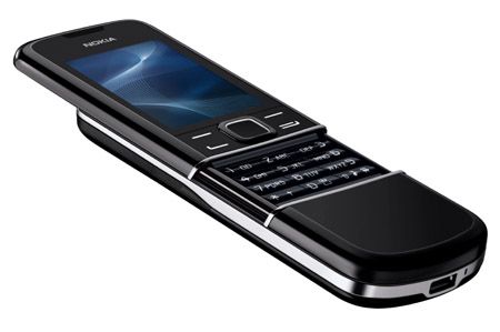
Nokia 8800 Arte: Buy it now
LG New Chocolate BL40
Introduction
When it came out in 2009, the LG Chocolate BL40 ended up being one of those most unique ,and kind of ambitious mobile phones from its time. It sat inside the LG Chocolate line, well the one usually praised for its sleek styling, so the BL40 felt like a bold attempt to push the boundaries of both the mobile phone look and the whole user interface a bit too. That stretched 21:9 screen gave it a long, almost drawn out appearance, the glossy cover was pretty reflective in person and the day to day functionality was genuinely fresh. With all of that stacked together, the BL40 was sold to people who wanted a real blend of style plus practicality not merely surface appeal, and that actually mattered.
This review covers the LG New Chocolate BL40 model in pretty close detail, while focusing on its appearance, bundled features , performance, and the influence it had on the mobile phone industry. There will also be an effort to place it within a modern-day context, to check if there are any lateral attractions left for today’s buyer or collectors, even if they’re searching for something nostalgic.
Design and Build Quality
1. Aesthetic Appeal
The LG New Chocolate BL40 first and foremost made a design statement. Its most spectacular feature was the 4-inch display with a 21:9 aspect ratio, which was unheard of at the time. The screen was tall and narrow, giving the phone a peculiar almost futuristic look. The purpose of this peculiar design was to provide an enhanced media experience, particularly when it came to widescreen movies, but it also served to make the phone stick out in a saturated market.
The phone’s body was encased with a glistening finish, chrome-lined edges. With the glossy treatment, the phone was sleek and modern looking but was also a fingerprint-smudging surface that over time could reduce its charm. One of the aims in designing the phone was minimalism, with very few physical buttons. Most of the interaction was intended through the touchscreen, setting into motion what has become the usual practice for mobile design.
2. Build Quality
About build quality, the LG New Chocolate BL40 was pretty solid and well built, you know. It felt substantial in hand, weight-wise at 129 grams, which really bumped up that premium vibe. The materials were top tier, and it had that reassuring “in your grip” sturdiness, like it would actually take everyday use and not crumble right away.
But still, it brought a couple challenges because of the longer design. With those uncommon dimensions, the phone felt a bit awkward when you try using it one-handed . Also, it was not the easiest thing to slide into smaller pockets , and even though the look is pretty nice, the shiny finish made it slightly harder to hold without slipping. These small issues might be seen as faults by people who care more about practical design, rather than aesthetics alone.
Display
1. Screen Quality
Among its differentiating features was the display of the LG New Chocolate BL40. Carrying a 4-inch TFT capacitive touchscreen with a resolution of 345 x 800 pixels, the screen boasted a pixel density of 217 PPI, which is really quite modest for today’s standards but was indeed very respectable back then, particularly due to the strange aspect ratio.
With the availability of 16 million colors, the visuals were quite vibrant and rich, hence creating the colorful display. The color rendition was mostly on the mark, while the display had a brightness level that could ensure comfortable viewing in most ambient conditions. The 21:9 aspect ratio set the screen to perfectly display movies in their native format while also providing room for more content when surfing the web or reading mails.
2. User Experience
That elongated screen really was both a boon and a bane for the BL40. It alchemized a huge media experience onto a unique selling point that also set it apart from other players in the market. However, this unconventional aspect ratio meant that not all content was optimized for the display: Websites, for example, would commonly display great expanses of blank space to the left and right, and some apps and games simply weren’t designed with the screen dimensions in mind.
The touchscreen gave a smooth, quick, and fluent response to any input, making it pleasant to navigate through the interface of the phone. On the downside, since the operating system was not optimized for that unusually long 21:9 screen, this sometimes could prove frustrating when merely trying to use an app designed for ordinary phones.
User Interface and Software
1. Operating System
Back in the day, the LG New Chocolate BL40 ran a proprietary LG operating system-the brand’s typical case, by the way. It was before that period when Android took over the market, and many manufacturers were still staking claims for their own software solutions. BL40’s operating system was probably the most heavily customized by LG with the S-Class 3D interface that was made to be visually pleasing and straightforward to use.
Essentially, the S-Class interface was based on a 3D cube construct through which one could swipe back and forth along the different home screens, each capable of being endowed with various widgets and shortcuts. It was meant to be simple to use and did so fairly well by making good use of the capacitive touchscreen of the phone. On the flip side, its proprietary OS meant that BL40 could not tap into the enormous collection of apps and services that were beginning to appear on other platforms, especially iOS and Android.
2. User Experience
The user experience on the LG New Chocolate BL40 was somewhat of a hit and miss. The S-Class interface, for instance, was dazzling graphically, with many options to personalize the phone according to one’s tastes. The 3D cube navigation, a new innovation, set this phone apart from its peers and was an interesting feature to play with.
The lack of support for third-party apps was an unmitigated obstacle. While the phone boasted a nice collection of pre-installed apps and widgets, users were shut out from adding more. App ecosystems were just getting into their stride at that time, and not being able to access the popular apps available on iOS and Android was a huge minus.
The proprietary OS also…well, let’s say it was lacking a little. The competitor had the beauty; here, some clunkiness of execution entered the rank. It was particularly noticeable when multitasking or running heavy apps. More so, the lack of dedicated software updates meant that the phone started feeling old quite fast when new and more featureful devices started to pour in.
Performance
1. Hardware Specifications
The LG New Chocolate BL40 arrived with an 800 MHz ARM 11 processor running at about that same pace , plus 256MB of RAM. At the time it looked like a solid mid level phone setup, but somehow it fell behind a couple of the fresh flagships, even though it shouldn’t have.
The handset also had 1.1GB of internal storage, and it could be expanded using a microSD card. When it comes to connectivity, the BL40 brought 3G, Wi-Fi, Bluetooth 2.1, and of course GPS. For charging and general data transfer, it relies on a micro-USB port , while music comes out via a 3.5mm headphone jack.
2. Real Life Experience
In day to day use, the LG New Chocolate BL40 felt a bit sluggish at times. The 800 MHz processor was ok for calls, texting, and light web browsing; but when heavier apps showed up, it became more of a headache. Multitasking was doable, yet once too many apps got opened together , the phone started to stutter in a way that killed that smooth gliding feeling.
Unlike other times, the switching between tasks became a slow process because of the pocket RAM, while at times, launching apps and moving around the interface came with a slight delay. Most of these were common traits for the phones released in this era, but they took some points off the user experience, especially for users transitioning from faster and more responsive devices.
Storage was another area where the phone fell short. With merely 1.1GB of internal storage, users were soon pressed to rely on microSD cards for additional space. This was bearable; however, it meant that users had to consciously think about how much content they were storing on the device.
3. Gaming and Multimedia
Games and multimedia performance perfectly highlighted one of the new Chocolate BL40 LG’s weaknesses: it was not a gaming powerhouse. The phone could handle basic games well, but then might produce a poor frame rate or simply not support more challenging ones. From this point of view, an elongated screen is an anti-gaming screen, as most titles are not optimized for the 21:9 ratio and so produce visuals that are either stretched or outright distorted.
However, multimedia time scores were high for the BL40. The screen actually benefited the viewing of widescreen movies with this unusual aspect ratio, while the phone’s video player supports many formats including DivX and XviD. The music player was pretty well designed too, with a sleek UI and support for many audio formats. The 3.5mm headphone jack was such a good move because it let one use their own headphones for better audio!
Camera
1. Camera Specifications
The 5-megapixel camera on the LG Chocolate BL40 was kind of considered an average specification for its era, I mean not too special. It came with autofocusing along with an LED flash, and also offered some modes and settings so users could customize the camera performance, depending on different environmental conditions . Overall it felt pretty decent but nothing extraordinary. The phone was also capable of video recording, though hardware limitations compromised video quality.
2. Image Quality
The camera of the BL40 could provide a fair amount of photos with good color reproductions and details when there was enough light. The autofocus generally worked fairly well, while the LED flash provided a bit of assistance in bad lighting but was not powerful enough to completely compensate for poor light. The performance of the camera was fair for a mid-range phone at that time but was not up to the higher-end performers like iPhone 3GS or Nokia N86.
This camera also was threatened by shooting modes such as panorama, macro, and continuous shooting. These modes allowed users to try out some types of photography and brought a bit of life to the camera.
3. Recording Videos
An LG New Chocolate BL40 could only record videos fairly well-mere ho-hum-were given the hardware limitations of the time. The camera could record its videos at a resolution of 720 x 480 pixels, which was like the usual thing back then for a bunch of mid-range phones. The videos would do just fine for a casual user, but, they would miss that sharpness and fine detail that modern-day users tend to expect.
The videos tended to be smooth to watch, given the rather constant frame rates; in contrast, the technical factors would mar the overall view, such as increased noise and lower dynamic range when faced with nasty lighting situations. The best results for the camera were in bright-light conditions, while the situation somehow did not favor this camera hardly in low light. Here, videos stretched into graininess and lost detail, which compromised their uses.
The BL40 didn’t really have the kind of advanced video recording stuff, like image stabilization, or full high definition recording so it sort of didn’t manage to attract people who were serious about mobile videography. But still, the video section was more than enough for the casual user, the one who just wants to snag a moment, you know, spontaneity while out and about, it worked.
Connectivity and Network Performance
Connectivity Options
LG New Chocolate came with a generous menu of connectivity choices, more or less what people at that time expected from any smartphone, ya know. You had 3G connectivity for mobile data, Wi‑Fi 802.11b/g for getting online, Bluetooth 2.1 for syncing with other devices, and GPS for location services. There were also the usual connection outlets like the micro‑USB port for charging and exchanging data, plus the classic 3.5mm audio jack.
The FM radio was a notable feature and an added jewel in the BL40’s crown. With it, users could listen to live-radio broadcasts and tune into their favorite stations without needing any internet. For such users who enjoyed listening to the radio on their mobile phones, the presence of an FM radio was a bonus and distinguished the BL40 from its competitors.
Network Performance
Regarding network performance, the LG New Chocolate BL40 was pretty reliable most of the time, though sometimes it felt a bit unpredictable. It offered a solid range of 3G bands, so it could attach to mobile networks in many parts of the world, even when signal conditions varied. Call quality was equal on both ends with clarity, loudness in the volume, with the microphone being adequate to make and receive calls.
Mobile data speeds were very much in accordance with what home users would have expected from a 3G device. Hence, the phone offered reasonably quick web browsing and app downloads, albeit slower compared to eventual speeds of 4G and 5G networks. In terms of Wi‑Fi, the phone also did pretty well, it made good connections with a decent range, however it didn’t quite support the advanced Wi‑Fi class, so it ended up not being able to use even the swifter networks at home or in the office.
Bluetooth 2.1 is still a bit old school compared to todays standards, but it was good enough for pairing a phone with wireless headphones, speakers, and other gadgetry. That said, file transfers and audio streaming could feel a little sluggish, and sometimes less dependable , because the data rates and the overall reach that Bluetooth 2.1 offers are inferior when compared to its newer relatives.
Battery Life
1. Battery Capacity and Performance
The LG New Chocolate BL40 was built around a 1000 mAh, Li-Ion battery, which was kinda small compared with today’s phones but pretty normal for that period. The battery itself was non removable, so some users probably found that a bit annoying, and in response they got used to bringing a spare cell for longer hours out.
In terms of battery life, the BL40 was capable of providing a full day’s worth of use on a single charge, assuming moderate usage. This included a little bit of everything such as calling, texting, browsing the web, and using a few apps. If entertainment took precedence, with video watching or gaming as activities, then the phone battery would tend to give up faster and would then require to be charged at noon.
In addition to the heavy use, the phone’s battery would not endure long because of that generous display-an impressive one, mind you, but hungry in power demands conforming to size and brightness. Somebody who kept the brightness to its maximum and employed the phone for extended lengths of time may well have noticed that the battery life was somewhat shorter than expected.
2. Charging
Charging the LG New Chocolate BL40 was accomplished via the micro-USB port; also, the phone came with a standard charger in the box. Charging times were standard for the era, as the phone would take a couple of hours for a full charge from dead. Fast charging tech, however, was nowhere to be found; so you had to be patient whenever you would have wanted to recharge it, especially if it was fully drained.
It also did not support wireless charging, which was still fairly new and rare back then. While it possibly would not have mattered for most users, it did place the BL40 one notch down with regard to conveniences that later smartphones made standard.
Multimedia and Entertainment
1. Music and Audio
Designed with multimedia consumption and music playback at its core of attraction, LG New Chocolate BL40 featured a decent music player app that supported audio formats such as MP3, AAC, and WMA. The application boasted a neat and intuitive user interface that made it simple for the user to navigate through the music library and choose songs to play.
The audio quality was quite decent, especially when using high-quality headphones. The inclusion of a 3.5mm headphone jack was a blessing, as it allowed users to use their own headphones without adapters. The loudspeaker, which was considered an okay one by the phone standards, was somewhat apt for casual listening or hands-free calling, but it lacked the depth and clarity that go with some really good sound systems.
2. Video Playback
As already hinted, the 21:9 aspect ratio screen was a great feature for the LG New Chocolate BL40, especially for watching some movies. The phone’s video player supported all common formats, including DivX and XviD, those arguably being the most widely used at the time. Thus, users were able to watch widescreen movies without letterboxing and truly immerse themselves in the viewing experience.
Video playback was generally smooth across the device; the bright colors and decent contrast of the screen made for a stronger viewing experience. The only downside, and really a huge one, is that the phone has a limited amount of internal storage space for videos; hence an external microSD card for storing one’s video library would be necessary. This is quite inconvenient for a user who wants to be carrying a large list of movies and TV shows with him.
3. Gaming
Gaming was never the forte of the LG New Chocolate BL40, and its working on the mobile games comes as an indicator of the same. Basic games worked without any issues, but as soon as high demands came along particularly requiring more processing muscle and were not optimized for the very screen aspect ratio it played with, it suddenly found itself at a bad place.
Even witching access to a strong app store would have limited the game offerings. There were a handful of games actually pre-installed on the phone, and a few others could be downloaded from LG’s app store, but it was nowhere near the array of choices offered to the users of iOS and Android back in those days.
Additional Features
1. S-Class 3D Interface
The LG New Chocolate BL40 retained its uncommon and distinguishing features because of its S-Class 3D interface, which was intended to be pleasing to the eye as well as functional. The interface follows a 3D cube design; every face of the cube stands for a different home screen. A user could simply swipe along the edges to go through various features and apps or support their widgets and shortcuts.
The S-Class interface contributed immensely to the phone’s charm because it gave the user a distinctive experience unlike any other device. However, the limitation of the interface came from the performance perspective. For one, the 3D effects could feel slow for an occasional user, and without the option of third-party applications, customization was greatly limited.
2. Messaging and Email
The LG New Chocolate BL40 provided numerous messaging and email options, which covered SMS, MMS, and email. For messaging, the application was adequate; simple and intuitive was a pleasure to work with. The phone supported push email so users could receive emails by the moment. Although fairly limited, it is not so much compared to a professional email client found on other platforms.
There were two Nick Wood numbers that mentioned the keyboard very much always being equated with “not good enough for chunky texting and emailing,” and only the high-dimensional screen would cause an online keyboard to feel queues-like when in portrait mode: The keyboard would most likely be less comfortable for those who type long messages compared to those known on more conventionally dimensioned screens.
3. Web Browsing
The LG New Chocolate BL40 had quite a capable browser rendering most websites, yet it was not as technically advanced as that found on iOS and Android devices. This browser showed such basic features like tabbed browsing and pinch-to-zoom but failed to support the more advanced technologies of the web.
The somewhat offbeat aspect ratio of the phone’s screen worked for and against it while browsing. The tall screen, in its favor, lowered the clear need to scroll by a good margin; something particularly helpful when tackling those long-winded articles or humongous lists. However, a disadvantage is posed by the screen being too narrow for some websites to display well, with text and images being falsely squashed or completely cut off.
Conclusion
LG New Chocolate BL40 was a very daring and innovative device that tried to push the limits of mobile phone design. With its signature 21:9 aspect ratio screen, thin design, and unique user interface, the BL40 made a statement in an already crowded marketplace. It had many of the features that were almost unheard of during that period, especially with respect to multimedia and design.
Still, the phone was certainly not without its share of problems: The screen’s atypical aspect ratio, while impressive to look at, was tricky to work with in terms of usability, especially when it came to content such as web pages or apps not optimized for such dimensions. The S-Class 3D interface was sometimes visually dazzling, though it had the occasional performance hiccup, and the general user experience was undermined by the lack of a solid app ecosystem.
Nokia 7900 Prism
Introduction
The Nokia 7900, introduced in 2007, is a very interesting piece thanks to its highly uncommon design. The presence of this particular series speaks a very direct language on mobile aesthetics from Nokia when it was at its peak: in other words, a daring statement. The 7900 Prism, with its sharp lines and geometric forms and colorful OLED display, appeals to that fashionable sort who considers the look of a mobile as important as the look of the owner.
Even with such looks the Nokia 7900 Prism was a bigger youngster in the evolution of Nokia’s strategy to set itself apart in the increasingly-nuanced mobile market where the first instances of smartphones were starting to show up. While a bunch of people were busy adding features, or just designing their phones to look more and more like an iPhone, Nokia kind of took a detour and decided to make their devices stand apart.
This review will go deep into the Nokia 7900 Prism, touching on design, build, display, overall performance, camera setup, connectivity, battery endurance, software, and that day to day user experience. By the book end, you’ll have solid grounds for seeing what actually made this phone feel great, and where it really excelled or where it fell short.
Design and Build Quality
1. Beautification
The Nokia 7900 Prism design had to be bold. The phone sported a unique diamond-cut pattern that traversed smoothly from the front panel to the back panel, thereby creating a sort of modern and avant-garde visual appeal. This geometric theme of design was carried further into the keypad, which was made up of angular, prism-shaped keys that fully complimented the design philosophy. It was a sharp departure from the much more rounded and mundane phone designs of the times, thus making the 7900 Prism truly a fashion statement.
The body of the phone was anodized aluminum, imbuing the phone with a handfeel of luxury; it is both light and sturdy. The back panel had a customizable LED light that glowed in different colors, imparting that little bit of flair and personality. The user could pick from 49 color combinations for this light so that it could match his or her mood or outfit-a fairly unique feature at the time.
2. Build Quality
As for Build Quality, the Nokia 7900 Prism certainly lived up to expectations. It made use of aluminium and fine plastic to give the phone a really solid feel. There was much thinking behind the materials and construction of this phone-reviewing team believes that Nokia wanted to engineer a phone that was stylish but at the same time, rugged.
Back in the day, it was big advantage for a phone to still be small and light enough to be handled with one hand, with all phones getting bigger. Anodized aluminum gave the phone a good grip; on the downside, however, the angular bodies with sharp edges could be a little uncomfortable to hold for any length of time.
The buttons were a little smaller owing to the geometric scheme, but they were so tactile and responsive that you actually wouldn’t want to change it. It might take a little getting used to, though, especially for people. The ergonomic trade-off, however, many users were willing to forgo for the sake of style with the nonconformist design of the 7900 Prism.
3. Dimensions and Weight
The 7900 Prism was kind of compact and easy to operate, at least that’s how it felt. It measured 112 x 45 x 11.3 mm and weighed a mere 101 grams, so it landed among the lighter and more pocket friendly phones from that time. Being thin and narrow also helped with portability, and honestly it was nice to keep it in pockets or smaller bags.
The phone dimensions made it simpler for one hand use, which mattered a lot for certain users. Even with its low mass, it still held up well and it gave that solid, confident feel, mainly thanks to the aluminum body construction.
Display
1. OLED Technology
The 7900 Prism got its name because it was one of the first mobile phones to sport a 2.0-inch small OLED display. At a period when TFT LCDs were ruling mobiles, the decision by Nokia to experiment with an OLED was perhaps one among a few factors setting the 7900 out from other competitors. Deeper black levels, better contrast ratio, excellent color brightness, and many more came with the ace of OLEDs.
A promise delivered by the Nokia 7900 Prism OLED screen meant that a richer and more dynamic viewing experience had already been promised to and received from all other mobile phones in that class. The screen resolution was modest at 240 x 320 pixels, giving a pixel density of about 200 PPP, which provided very sharp and clear outputs for such display sizes.
2. Color Customization
Nokia wanted to improve its customizable personality by allowing the user to custom-color the interface. The feature followed the phone’s emphasis on style and individuality, allowing users to pair the interface colors with that of the LED backlight and the phone itself. Such degree of customization was often hard to find back then and was an attractive feature for fashion-conscious users.
2. Display Quality
In general, the Nokia 7900 Prism was revered by visual display purists and in most lighting conditions. The OLED screen provided excellent color reproduction: bright and intense colors that allowed all photos and text to glow with perfection. The deep blacks and extremely decent contrast ratios were appreciated because this display somewhat goes contrary to richness that was hard to find in other phones of that time.
Nevertheless, their real-world experiences in multimedia content viewing and web browsing suffered a bit due to what some would say was too small a screen. The 2.0-inch display was crisp and perfect for color presentations, but it felt somewhat restrictive for those who had got used to larger screens. Additionally, screen visibility under direct sunlight was just average, and the reflective surface was working against bringing out the utmost clarity of the display in bright outdoor viewing conditions.
Performance
1. Processor and Memory
Nokia 7900 Prism was powered by the ARM 9 processor, which was generally considered as a standard one for mobile phones during that period. The processor with 1 GB of internal storage and 128 MB of RAM gave decent enough performance for all cases presented by the phone. While the specifications can sound inadequate in today’s times, they were perfectly fine at the time for just calling, texting, basic web browsing, and a little application running.
The 1 GB of internal storage was somewhat limited, more so given there was no option to expand it using a microSD. This meant users would have to consider storing content, especially if they had a lot of music, pictures, or other media on the device. But for those who generally used their device for communication or carrying out very basic tasks, the storage pretty much was sufficient.
2. Interface and Responsiveness
The Nokia 7900 Prism ran on the Series 40 platform- that was basically the standard OS for Nokia feature phones at the time. Series 40 UI was kinda popular because it kept things simple and easy to use, so the handset felt approachable even for people who werent really comfortable with tech. Also it was pretty tidy and straightforward, with a menu system that was easy to get into, and yeah it made everyday use feel effortless.
Regarding responsiveness, the 7900 Prism performed well with almost all basic tasks. The phone accepted and responded to inputs immediately while transitions from menu to screen were fast. However, when it came to more demanding tasks, it would not give a perfect performance-going heavy content browsing on the Web with ease or dealing with some Java applications could become a little difficult for it. Due to limited RAM and processing power, it was advised to keep the usage light, and then there might have been lag or slowdowns experienced if an attempt had been made by anyone to push further than the device was made for.
3. Gaming and Applications
The Nokia 7900 Prism let you play the usual simple Java-based games for the feature phones of the time. A few games came pre-installed out of the box, and you could have possibly downloaded some games from Nokia’s online store. However, due to limited hardware processing power and size of its 2-inch display, the phone was not really meant for gaming.
In the application department, Series 40 did offer a basic set of apps, including a Web browser, e-mail client, calendar, and some productivity tools. While the Series 40 app ecosystem was not nearly as big as that of the smartphones, it offered just enough level of functionality for casual users that needed basic apps for day-to-day tasks. There was no support for third-party apps, but that was in line with the telephone’s avowed simplicity and ease of use.
Camera
1. Camera Specifications
The camera of the 7900 Prism was equipped with a 2-megapixel lens which was quite standard for feature phones at that time. It had a fixed focus with no flash, which seriously hampered ability for taking good pictures in comparatively dim light. Now, the camera was never really meant to determine the success of this one; it was sufficiently good to do casual photography and capture moments on the way.
2. Image Quality
Under good conditions, the 2-megapixel camera on the 7900 Prism was able to yield decent image results. Images were generally clear and sharp, well-colored, and had a fair amount of detail for being shared on social media or just looked at on the phone screen. Camera performance in low-light scenarios was bad, with the resultant images possibly being grainy and deficient in detail.
Without the help of LED flash, nighttime or indoor shots affected the performance quite a lot, with clear images quite distant from realization. The fixed focus lens also means that users must consciously stay at a suitable distance from the subject, as the camera does not allow focusing on objects at varying distances.
3. Camera Interface and Features
Interacting with the camera Nokia 7900 Prism is a delight, being on par with the phone’s simplicity. From the main menu, users could easily gear the focus on setting control from white balance, exposure to resolution.
The camera supported video recording, but the quality had limitations similar to those impinging upon its still capture. The Nokia 7900 Prism made video uploads that felt, reaching a max resolution of 176 x 144 pixels while running at 15 fps. The picture size was enough for basic video clips, but because there wasn’t really image stabilization, and the resolution stayed low, the footage often got shaky, plus it lost detail in dim light moments.
The camera application also had a rudimentary set of photo-editing functions with which users could apply fairly basic effects like sepia tone, grayscale, and negative to their pictures. Those features could be amusing to play around with, but honestly, they didn’t provide the sort of customization or control that would be found on more advanced camera phones or digital cameras.
4. Real-world Usage
In practical terms, the camera system of the Nokia 7900 Prism was more than capable of capturing casual shots and moments in daylight conditions. It satisfactorily performed the task of capturing snapshots, scenery, and friends and family during daylight hours. It wasn’t, however, something that could substitute for a dedicated digital camera for users who appreciate photography at a higher level or require advanced camera features.
The 2MP resolution was enough for sharing images via MMS or over email, but the trade-off was unsettlement of large photo prints or cropping of images with loss of huge detail. Hence, camera-oriented people probably considered it a secondary attribute, hardly being a key selling point in itself, for the 7900 Prism.
Connectivity and Network Capabilities
Network Support
The Nokia 7900 Prism was aimed to be a GSM network supporting phone; hence, it was operating on 2G and 3G bases. Precisely, it was functioning on GSM 900/1800/1900 and UMTS 2100, bringing common roaming facilities in many parts of the world. It made the level of network support ideal for a person who always moved around and needed a handset that could hook to varied networks worldwide.
The 3G, being a major feature by then, was still quite new in its pathways of being established. Not 100% of areas or operators allowed their networks to be 3G. Once 3G was available, it still gave an edge over 2G in data speed; faster data speeds meant a smoother browsing experience on the web and faster downloading of content.
2. Data and Internet
The Nokia 7900 Prism had this lightweight web browser, it let people hop online using GPRS, EDGE or even 3G networks. The whole thing was kind of aimed at small duty web use, like checking e mail, skimming some news, or going to mobile-optimized sites. Trying to do the heavier work of actually browsing the Web on that petite display, with the less powerful processing behind it, was probably clunky , and kinda annoying, not like on bigger gadgets that had more muscle for the grunt of it.
The browser supported only basic HTML or WAP 2.0 web pages but would have had a tough time coping with heavy graphics, multimedia content, and advanced scripting. Downloading Java-based apps and games requiring an internet connection was possible, but a somewhat limited online experience was offered due to the sparse app ecosystem and limited processing power.
3. Connectivity
The Nokia 7900 Prism did support Bluetooth 2.0 with A2DP, so people could link up to wireless accessories , like Bluetooth headsets, portable speakers, and even car kits. Also file sharing worked over Bluetooth between compatible devices i.e., other phones or some computers so transferring photos, music and other documents was kind of a cinch, really easy.
The device posed a micro USB 2.0 port for wired connectivity. It was used primarily for charging the device but was also used for tethering the device to a PC for file transfers and synchronization of data. USB connectivity was a typical feature in phones from that era and thus gave users a sturdy method of backing up their data, updating their software, or managing files on the device.
4. GPS and Location Services
In-built GPS was absent from the Nokia 7900 Prism; this was a very common feature absent in feature phones at the time. Though fast gaining popularity in high-end smartphones, GPS was a little rare in feature phones like the 7900 Prism. Because of this absence, location-based services and any navigation apps couldn’t be supported on the phone, limiting the potential utility for users who would otherwise need the feature.
The lack of GPS really would not take away much of the experience for most users as the phone was really an elegant communication and basic multimedia device rather than an advanced navigation or location services tool.
Battery Life
1. Battery Capacity and Performance
The Nokia 7900 Prism was fitted with a 700 mAh Li-Ion battery, a really small capacity in modern times, but this was the norm back then for a feature phone. The battery was removable, so users could replace it when actually needed. This was a common practice back then before smartphones arrived with sealed, non-removable batteries.
Even so, what the battery provided was less than excellent when thinking about a device of this class. Case in point, talk time on 3G lasted only about three hours, while on 2G, with some straight usage, it could even go up to six. Standby time was rated at 240 hours; hence the phone, if light to moderate usage has been permitted through, can easily stay for a couple of days on one charge.
Given the nature of the overarching tasks, the OLED display would be the most energy-efficient display, second only to LCDs under less energy-demanding situations. But taking heavy-duty assignments like browsing or video viewing into consideration, power consumption was high for the display. But otherwise, with a very low power-hungry CPU and a general lack of power-hungry features, the phone gulped power with utmost respect.
2. Charging
Charging, along with micro USB on the Nokia 7900 Prism, was quite a convenience because of its generic cable type with wide availability. Charging times, on the other hand, may be considered short because a full charge would take around two hours. However, the lack of support for fast charging was something not expected of any mobile device at that time.
With the battery capacity, most found it very easy to just leave the phone charging overnight, and it was good to go until the end of one day of usual activities. Although it would suffice, for heavier users, top-up midway could be wise, especially if it was heavily utilized for call purposes or net browsing.
3. Battery Life in Real-World Usage
In real-world usage, the Nokia 7900 Prism battery life was, in general, sufficient enough to meet most users’ demands. Being power efficiently designed, it would really get through a day of normal use. Normal use included calling, texting, and perhaps listening to music. However, if users started demanding more from it with activities such as web browsing, gaming, or heavy Bluetooth use, the battery might have drained faster.
On the whole, the battery of the 7900 Prism performed as one would expect out of a feature phone of its era. It did not have extended batteries as found in some of the bigger phones, but generally, it was enough for those who put style and in a small package over big-time endurance.
Software and User Experience
1. Series 40 Platform
The Nokia 7900 Prism ran on the Series 40 platform, which was Nokia’s own operating system made for feature phones. Series 40 was kind of known for being pretty elegant at delivering an interface that feels user-friendly, stable, and also efficient. It was built with broad accessibility in mind , from a tech-savvy person to somebody who just wants a simple and direct kind of experience.
That interface was organized around a grid based layout, where each icon stands in for a specific function or app. Scrolling and moving around mostly happened with the D-pad, and the soft keys then gave context-sensitive choices. Overall, this setup felt intuitive and familiar for people who had used Nokia before, because it came with little-to no learning curve , and you could pick it up fairly fast.
2. Customization and Personalization
Despite all its flaws, the emphasis on personalization was a strong suit of the Nokia 7900 Prism. Users actually could customize the huge range: from the interface color scheme to the menu backgrounds and highlight colors, which were ideally matched to the color of the LED lighting placed at the back of the phone.
Apart from color customization, one could change wallpapers, ringtones, and themes. Nokia had obviously provided some themes pre-installed, but new ones could be downloaded from Nokia’s online store or even made by oneself. This was the highlight of customization: the 7900 Prism attracted users who wanted their phone to reflect their own style.
3. Pre-Installed Applications and Features
The Nokia 7900 Prism had applications already installed that catered to basic mobile communication and productivity:
Phonebook: A contact management application where users could save and categorize their contacts, along with giving options for adding multiple phone numbers, e-mail addresses, and other details for each contact.
Messaging: Supported SMS and MMS. It had a very basic and useful interface for composing, sending, and receiving messages. The phone also supported Nokia’s Xpress Audio Messaging, enabling the sending of voice messages as audio clips.
Calendar: The app was a rudimentary calendar with very basic functionality that allowed users to schedule appointments and set reminders. Events could be viewed in monthly or daily formats.
Alarm Clock: The alarm clock was a simple one, having three alarms set standards, allow repeats only on given days of the week.
Web Browser: This inbuilt browser supported kind of basic browsing, with access to both WAP sites and HTML ones aswell. It was limited in functionalities and still it fit well for simple tasks like checking emails, reading news, or going through mobile-optimized websites.
Music Player: This player handled MP3, AAC, and WMA formats, no extra drama. The interface was basic but usable, letting you browse and play music files saved on the phone. Shuffle and repeat were there, plus the ability to make playlists and basic lists, those were really the main parts included.
FM Radio: The FM Radio app let users listen to live radio stations, and also save presets for later. It even used the phone’s headset as a kind of antenna, which sounds small but worked nicely. This feature was hugely liked by many people, because it kept them connected to live broadcasts while moving around, or in their roam.
Gallery: The gallery app had a very extremely basic interface for viewing and arranging photos, videos, and other media stored on the device. People could create folders to categorize everything, or just watch images through a slideshow style view, quite plain, but straightforward.
Calculator: The app provided for doing very basic arithmetic operations and was a very handy tool for quick calculations on the fly.
Notes: Notes helped users jot down reminders, groceries, or to-dos-one way or the other. In essence, it helped keep one’s affairs intact! A great, simple tool for organization.
We also had some in-built Java-based games-the mainstream entertainment on a feature-phone. These games were light-weight, generally optimized for the device hardware, offering a rather casual gaming experience to the users.
4. Nokia Services and Connectivity
Besides these local apps, the 7900 Prism Nokia gave users access to Nokia’s online services like Nokia Store (formerly Nokia Ovi Store). Henceforth, by using the store, users could download more applications, themes, ringtones, and wallpapers, thereby enhancing the capabilities of the device and its personalization to a great degree.
The phone also enabled apps based on Java, whereby a user could install several third-party apps supporting Java ME platforms. This feature gave access to a huge set of tools and games that could be fun to use and that would complement the device with additional functions, in spite of not being able to compare with the number of modern app-stores available.
An additional feature offered by the Nokia 7900 Prism was its email support via the built-in email client that helped users set up and follow their email accounts. The client would accommodate the usual email protocols, such as POP3 and IMAP, making it compatible with nearly any email service. Although it was certainly more of an unwieldy experience to manage email on a small screen with a keypad compared to modern-day smartphones, it was certainly a useful feature for users on the go.
5. User Experience and Performance
By and large, limitations and strengths of the Series 40 platform defined the user experience of the Nokia 7900 Prism. The interface attempted to keep things simple and straightforward, with quick access to most commonly used features and centered on reliability. However, it had the disadvantage of having rather limited processing power and a very small screen, thus web browsing and other resource-attractive tasks would not seem to be very smooth when carried out on this device.
Performance wise the phone felt generally more stable, it lagged barely or not at all, and crashes were not really something you had to keep in mind during normal use. Series 40 was basically a platform tuned for the Nokia 7900 Prism hardware, so it made sure the handset could carry out its assigned tasks with out any hiccups. The primary concern users could keep in mind was the limited onboard memory, as it lacked any card slot, so storage space was an issue to be mindful of when downloading new stuff or storing media files.
One part where the user experience deviated from the norm was in the rather expansive options available for customization. The ability to customize the interface, LED lighting, and a few extra adornments placed the Nokia 7900 Prism above rival devices in its class. That emphasis on style and individuality was integral to the phone’s appeal-let alone endearing it to users who settled for nothing but a product that was both tool and fashion statement.
Durability and Build Quality
1. Materials and Construction
The Nokia 7900 Prism was made with this mixture of more upscale materials, to make it feel sleek in your hand, you know. The front and back were put together from glass and aluminum, and the sides had this fairly durable plastic. Due to aluminum being a lightweight metal, it adds to the rigidity of the phone and protects it from accidental dents or scratches, whereas on the other hand, the glass gives it wash and modern elegance.
Build quality was among the strong points of the Nokia 7900 Prism. Known for its never-loose styles of manufacture, preserveable to a certain extent, the 7900 Prism felt substantial in the palm, without the space for creaking or flexing, under pressure. The materials stand to scratches and abrasions, so the phone keeps its charm with the passing of time.
2. Durability in Daily Use
In terms of durability, the Nokia 7900 Prism was a befitted device for daily use. Compared to some big, more fragile devices, its compact size and rugged build rendered it less susceptible to being damaged through a drop or impact. Besides an aluminum framing offering further defense, the tiny, lightweight phone was always less prone to receiving major damage when dropped from the hand.
Due to the intention of their design, the buttons and keypad were highly resistant to heavy usage. The D-pad and keypad buttons comprised a hard plastic material that would very rarely wear off or become defective even after prolonged use. The mechanism employed to open and close the battery cover with the hinge did not, at the very least, show any signs of weakness or wearability throughout the years of use.
A glass-front and back panel could have also formed a source of concern for the user, for it could shatter if the phone were dropped on a hard surface. This was the case for almost all phones involving the use of glass, and it was hardly a big problem if one took care of the phone.
3. Resistance to Environmental Factors
The Nokia 7900 Prism was not really a water-resistant, nor a dust-proof phone, more like a pretty standard trait for phones made around that period. It could handle small encounters with moisture , like a light rain drop or a quick splash here and there. But it was not designed to be submerged in water , or to take the heavy pounding of dust. Because of that, the user had to be a bit careful , especially when using it where those elements might show up.
Aside from those smaller details, the device still gave decent cover in everyday conditions. For instance, the battery cover fit tightly, and the internal parts were assembled with decent precision , which helped stop dust and grime from getting inside. That mattered a lot for keeping everything running longer and smoother over time.
Long-Term Reliability
From a long-term perspective, Nokia 7900 Prism was regarded as being reliable. Several users claimed their devices worked reliably through many years, with hardly any hardware or software issues coming in between. The battery, being somewhat small, was at the same time strong enough to hold a charge throughout the life of the phone. Those few users who needed to replace the battery were able to do so without a fuss, with replacement batteries being easily accessible.
The phone, on the other hand, was a hard nut to crack when it came to durability, according to users who said that it lasted well in terms of keypad and buttons, maintaining its responsiveness as well as functionality for long periods of use. Good quality material used for the construction of the phone gave it an edge for longevity, making it an excellent choice for users looking for a phone that will stand the test of time.
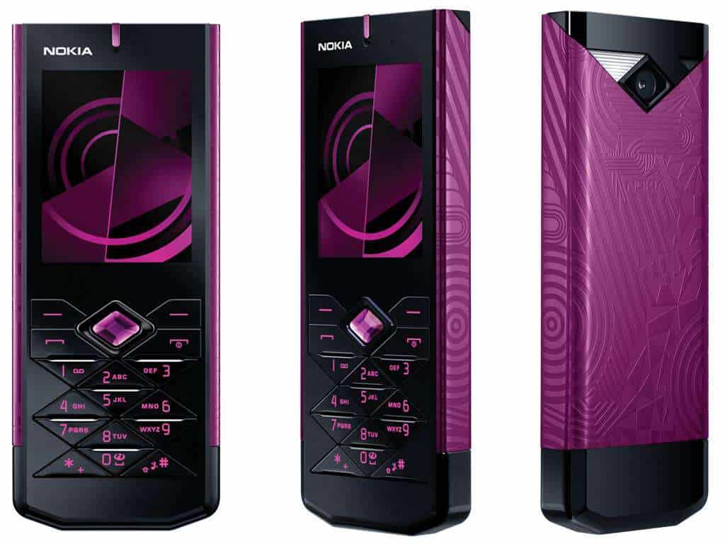
Nokia 7900 Prism Unlocked GSM (Black) – International Version No Warranty: Buy it now
Motorola AURA
Introduction
Motorola AURA makes its mark as one of the remarkable stories in mobile phone history, where state-of-the-art technology met luxury to create a masterpiece. Among Motorola’s key feature phones, the AURA was created to serve a limited clientele who would value both extraordinary design and superb functionality. This review thus examines various aspects such as the Motorola AURA’s design, performance, user experience, and influence on the market, culminating in a thorough perspective that explains why this instrument remains a landmark in the history of mobile phones.
Design and Build Quality
1. Loveliness
The AURA phone has often been raved about for its luxurious and independent design, which really sets it apart from other mobile phones of its day. Features include a circular-shaped display with an innovative rotating mechanism. The front side of the phone makes use of high-grade stainless steel frame to lend it a much tougher yet elegant feel. The usage of stainless steel not only enables the phone with long-lasting durability but also gives it that touch of class that one notices immediately.
The rotating display mechanism is an engineering feat and one of the most distinctive aspects of AURA. When the handset opens, the display rotates to unveil the screen and keypad, blending one mode into another in a rather poetic fashion. And this choice was never an aesthetic playing; it was designed to enhance user experience with a smooth transition from one interaction to another.
2. Materials and Construction
In keeping with the prestigious aura, the phone was crafted by the finest and rarest materials. A fusion of stainless steel and plastics form the body of the phone. The stainless steel used to constructed the front panel and frame is hard and scratch-resistant, which ensures a long life. The back panel, made of fine-grade plastic, stands in contrast with the sleek metallic front.
A thin layer of hardened glass protects the circular display, an enhancement of the durability of the whole device. The build quality of the AURA is first-rated, with no apparent gaps or looseness. The utmost precision in engineering ensures that the display moves smoothly during rotation and stays firmly in place once opened.
3. Ergonomics and Comfort
Designed with ergonomics, the Motorola AURA gives an enjoyable kind of feeling when you hold it and use it, it feels kinda right from the start. The circular display plus the rotating mechanism, offer a singular interactive experience , both engaging and practical. Its compact shape makes it easy to carry, in a pocket, or maybe in a handbag, and those rounded edges feel comfortable in your hands.
About the keypad, it shows up once you open the phone. The buttons are spaced out pretty generously and they don’t take much time to press, plus they have a firm tactile response so it feels satisfying right away. Overall the phone stays balanced, giving similar weight to the visual charm and the day-to-day usability.
Display and User Interface
1. Circular Display
The AURA’s display is a standout feature of the phone. The 1.55-inch diameter circular screen was one of the boldest design decisions ever made for a phone. With the QVGA resolution (320 x 320 pixels), the display was quite impressive for a feature phone at the time, even though it would be quite insignificant today.
Surrounding this circular display is a polished stainless steel bezel, adding a touch of cynosure to the handset. The display itself shines and glows, is 100% legible in daytime, has good color rendition, and excellent contrast. The layman may want to call this “out of the ordinary,” but for a creative display of this gourmet grade, the special shape stitched itself into define immersion-a treat for precious photograph appreciation, videos, and other media.
2. User Interface
The Motorola UI is customized for AURA, fitting the unique display specifications of the phone. It is designed to be intuitive for ease of use and simple to access core features and applications.
The main menu appears as a circular layout. The icons hug the edge of the display. It purposely takes advantage of the circular interface design to allow users to actually use a swipe or rotation of their phone in navigating the menu and options. The interface responds quickly and smoothly, making that crisp user experience feel rewarding.
3. Customization and Themes
Motorola AURA brings a lot of customization options, so the user can sort of shape their device according to how they want it. There are several themes and wallpapers that the phone supports too, and you can swap those around easily right in the settings menu. Also, users can assign custom ringtones plus notification sounds, which makes the whole experience a bit more personal.
The circular display gives room for some lovely visual effects and animations that complement the overall user experience. They exploit entirely the peculiar display of the phone to create an engaging and beautiful interface.
Performance and Functionality
1. Hardware Specifications
The Motorola AURA runs an operating system proprietary to Motorola optimized for the hardware of this device. It was provided with 2 MP of camera functionality, which was almost a feature for feature phones at that time. The camera can basically box up some photos and videos.
The AURA comprises 2 GB internal storage space for storing images, videos, or other types of media. In this advanced state, such storage capacity sounds insufficient, but then for this feature phone, this was all one required to save important files.
2. Battery Life
Battery life is one such pivotal element in a mobile phone, and Motorola AURA does fare well in this case. The phone houses a removable 950 mAh battery, and the battery life is pretty fair for a feature phone. With proper use, the phone should last through a whole day on one charge, while standby time extends well over 24 hours.
Making the battery of the phone stand out is also the power efficiency of the display and the operating system. The circular display, though an absolute treat for beauty, does not drawing too much power, thus allowing the phone to give good battery performance over the entire day.
3. Connectivity and Network Support
The Motorola AURA offers a variety of connectivity options, with GSM network support being included for voice calls and text messaging. It even has Bluetooth functionality, which lets one wirelessly attach headsets and speakers. Conversely, the AURA does not support 3G or Wi-Fi connectivity, something very typical of a feature phone back then.
The lack of further advanced connectivity options would limit the functionality of the phone today, but they were perfectly fine back then for those who just wanted a good device to communicate on in terms of voice calling and some basic media consumption.
Camera Performance
1. Camera Specifications
The Motorola AURA carries a 2-megapixel rear camera; this was the standard feature among feature phones during the late 2000s. The camera offered very basic functions, such as still photo capturing and recording video clips. The camera interface consists of simple options, including changes to brightness and contrast.
2. Image Quality
The image quality from the 2-megapixel camera of the AURA is appropriate for a feature phone; decent sharp and clear pictures come about in good lighting. The camera is good for capturing everyday moments; however, it collapses in low-light situations, where the quality of images gets compromised.
The phone’s camera can record videos with basic resolution, which is good enough for short clips. The video quality is limited by the hardware and resolution of the phone and doesn’t come close to the extensive HD video capabilities offered by modern handsets.
User Experience
1. Ease of Use
In terms of user friendliness, the Motorola AURA is somewhat basic and simple, especially considering its truly genuine interface, which really is about simplicity. Because of the circular display combined with the rotating mechanism, it offers a unique way and an engaging way of interacting with the phone, which helps ease some aspect of navigation through menus and options.
The keypad is very pleasant in design, responsive to the touch, and gives good tactile feedback. The keypad layout is straightforward, thus making for pleasant typing and dialing. In general, the AURA offers a good user experience with a good balance between design and functionality.
2. Software and Applications
Motorola AURA operates on a variant of Motorola OS specially adapted to define the characteristics of the phone’s unique display. The software bundles some essentials such as web browsing, email, and media playing capabilities. Nonetheless, due to the phone’s limited hardware power and connectivity options, it does not support many of the more advanced features available in today’s smartphones.
Optimized for the phone’s hardware, the AURA software delivers a smooth and responsive experience. The user interface is designed for the circular display, with visual effects and animations that enhance the experience.
3. Multimedia and Entertainment
More entertainment offerings give the Motorola AURA including the inbuilt media player for playing music and videos. It supports several types of file formats, enabling users to enjoy all their favorite media contents while traveling.
The circular display allows a view and an experience for both viewing photos and videos, whereby color reproduction and contrast are adequately used. Though the views are quite tiny, it is apt for viewing media content in a portable form.
Market Reception and Legacy
1. Initial Reception
Being one such phone, the Motorola AURA was a high-end feature phone for a select cadre of users who treasured luxury and design. The phone was appreciated by critics for its distinct design and quality construction, especially the circular display and rotary mechanism.
Nonetheless, the AURA had its limitations. Critics found fault with the lack of advanced connectivity options and moderate hardware specifications in a market that was increasingly moving onto smartphones with enhanced features.
2. Competitive Landscapes
When Motorola AURA was launched, many feature phones and early smartphones were competing. Because of the AURA’s design, it was an entirely different breed from the competition, of touch-screen-advanced phone, of app ecosystem, and 3G connectivity.
By design and appeal, the AURA, due to its essence and beauty, was never meant to compete with the smartphones on a direct level. Thus, it found a niche-level existence, catering to those whose conscience lay more in style and craftsmanship than in technical specification.
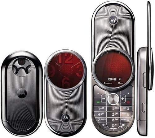
MOTOROLA AURA R1 2GB SILVER LUXURY FACTORY UNLOCKED CLASSIC 2G GSM CELL PHONE: Buy it now
Motorola RAZR V3
Introduction
The Motorola RAZR V3 is one of the most historic models of mobile phones that came out in 2004. It’s usually remembered for its elegant look and for adding the newest technology of that moment, the RAZR V3 sort of turned into a pop culture thing and it also started fresh trends for flip phones. The appeal of this device was boosted by its thin body, firm build quality, and the well promoted feature set. Somehow it managed to grab the users’ curiosity while at the same time pushing a direction for newer mobile gadgets. This long review moves through basically every angle of the Motorola RAZR V3, from design, to performance, to the day to day user experience, and even what it left behind as a legacy.
Design and Build Quality
1. Visual Appeal
The Motorola RAZR V3 is a classic case of a sleek design that felt almost like a new style when it was introduced. It has that distinctive flip mechanism with a thin clamshell layout which was shown off as being light years away from the bulky phones that ruled the early 2000s. Its slim profile, keeping the thickness to just 13.9 mm when closed, set new standards for the design of a mobile phone, like literally.
The exterior of the RAZR V3 comprises anodized aluminum, which gives it that premium look and feel, further lending to its durability. The metal finish is offered in numerous colors, from classic silver and black to some choice limited editions, from which one can pick a model that fits his/her style.
2. Materials and Construction
The RAZR V3 kind a shows the build quality of a handset, it’s basically a testimony to the very standard of craftsmanship that Motorola holds for itself. The anodized aluminum body is light but also extremely sturdy, so you get that precious feel you’d expect from a high end product, yet it still survives everyday wear and tear without much worry. The hinge mechanism on the phone is crafted to be sturdy yet surprisingly smooth, and when you open and close it, the whole action is gratifyingly crisp.
Design, Finish, and Detailing
The level of detailing puts in the construction of the RAZR V3 is evident in the precision with which the product fits and finishes. At a surface level, the phone is pretty much without any gaps or imperfections, and the quality of how the metal finish is applied is really high. That overall gives the impression of something heavy, sturdy and well put together, so it boosts the whole premium vibe.
3. Ergonomics and Comfort
The Motorola RAZR V3 is made to sit nicely in the palm, and also to fit the pocket without fuss. When it’s folded, it ends up slim enough so it slides through pockets or smaller purses easily. The rounded edges plus a smooth touch help you keep a comfortable grip, while the flip has this reassuring tactile feel, like it responds when you open it and when you close it.
Since the buttons of the keypad come into view once the phone is flipped open, the RAZR-V3 has well-spaced keys offering good tactile feedback. The layout of this keypad is very intuitive and allows one to easily dial numbers and type text messages. Design-wise, the phone is focused on comfort and ease of use, which has helped in making the phone enormously popular.
Display and User Interface
1. Main Display
The Motorola RAZR V3 boasts a 2.2″ TFT display with a 176 x 220 pixels resolution. Unassuming by today’s standards, it was quite laudable back then. The brightness and color reproduction were sufficiently great, offering clear and vivid viewership for its era.
It has a hardened-glass screen that keeps the glare minimum and protects from scratches. Watching text messages, call information, and simple graphics is just right. The resolution and size of this screen, although limited when compared to modern-day smartphones, were suitable for what the phone aimed to do.
2. External Display
Besides the main display, the RAZR V3 is equipped with a minute external display measuring 1.3 inches, which comes into play for showing notifications, caller ID, and other important information when the phone is closed. The external display allows one to quickly and conveniently check the status of the phone without the inconvenience of opening the device.
The outside display is monochrome, with a mere 96 x 80 pixel resolution. Whereas it does lack advanced features compared to the main display, it gets the job done by offering quick-grab information only. It is a backlit display, thus providing good visibility no matter the lighting conditions.
3. User Interface
The Motorola RAZR V3 runs on a customized version of Motorola’s operating system, which is tailor-made to complement the hardware and display of the phone. The UI is easy to understand and intuitive, orienting everything around ease of access to basic features and functions.
The main menu is represented via several icons and can be browsed through using the direction keys on the phone. The interface feels pretty responsive and, honestly, accommodating too, it gives users a layout that’s straightforward enough so you can reach apps and settings quickly and with less fuss. The RAZR V3 also brings a handful of customization options that let people personalize their device, like choosing wallpapers or changing ringtones, and it kind of makes everything feel more tailored.
Performance and Functionality
1. Hardware Specifications
The RAZR V3 comes with a storage capability of 5 MB, which it uses to store contacts, messages, and multimedia files. Though limited in capacity by today’s standards, it was sufficient according to what the phone was meant for. On the other hand, the phone supports external memory via a miniSD card slot, which allows users to enhance the storage into which media files can be saved.
2. Battery Life
Battery life is perhaps one aspect every cell phone user considers, and Motorola RAZR V3 does not disappoint on this front. The phone is equipped with a 680 mAh removable battery, fulfilling good average battery life for a feature phone. It should within reasonable limits last a whole day of usage on a single charge, with standby time beyond 24 hours.
Complementing the battery are the power-efficient display and operating systems. The phone’s hardware and software fairly optimize power consumption, ensuring that even without a recharge, one would be able to make good use of the RAZR V3 throughout a day.
3. Connection and Network Support
The Motorola RAZR V3 is a GSM type of phone and it can, therefore, work in most cellular networks. The phone is made mainly for voice calls and SMS messages, with some support for GPRS data-related activities for very basic applications of the Internet.
The RAZR V3 lacks 3G and Wi-Fi, a characteristic well in tune with its days as a feature phone. Its means of connectivity are quite limited when compared to today’s smartphone, but that was sufficient for the few basic functions it had to offer.
Camera Performance
1. Camera Features
The Motorola RAZR V3 comes with a 0.3-megapixel VGA camera, and that was pretty much a standard outcome for feature phones back in the early 2000s. You get minimum-level usability, like still photo taking and video clip recording, nothing too fancy.
The camera screen feels simple and direct, it lets you tweak brightness, also contrast. It doesn’t include things like autofocus or optical zoom, and yet it can do enough for basic picture work, to snag everyday moments when you need them.
2. Photo Quality
It can deliver somewhat better quality of photos with well-lit conditions and great sharpness for a feature phone, but the camera fares not well at all in low light, drastically undermining the quality.
The camera is capable of recording videos at average resolution, with sufficient performance for very short clips. Nevertheless, the quality under such recording conditions cannot be really called up to par with higher-resolution digital video recording capabilities that modern-day smartphones are able to provide.
User Experience
1. Ease of Use
The Motorola RAZR V3 gives a pretty wonderful user experience, with an interface that is kinda simple and intuitive, it feels like it sort of gets you right away. The flip design also feels quite nice, when you snap it open or when you snap it closed, and it really helps the whole vibe of using it in a positive way, somehow.
The RAZR V3 keypad is well made, responsive keys, and good tactile feedback, so dialing up numbers or sending text messages is pretty straightforward. Those little design bits seem tuned for user comfort, and everyday ease, so the appeal just keeps going, even after you’ve used it a while
2. Software and Applications
The Motorola RAZR V3 runs on a customized enhanced Motorola OS, which works alongside the phones hardware and screen. The software includes easy tools like the browser, an email client, and a media player. Still, since the device has limited resources and basic connectivity options , it can’t really handle the kind of features that feel common on newer smartphone models.
Operating system
The software, being optimized for the hardware, has allowed for smooth and responsive operation. This user interface is truly the first of its kind in that it draws user aspirations from the design of the phone, including some pretty lumping animations and effects that look great and just make the whole experience wonderful to behold.
3. Multimedia and Entertainment
Motorola RAZR V3 offers multimedia features and entertainment, inclusive of a media player for music and video. The phone boasts a wide range of format supports so that its users can sneak in a little relaxing time with their favorite media.
The external display of RAZR V3 provides an instant glance at alerts and other information without opening the device. Potential users will surely appreciate the phone’s multimedia capabilities paired with stylish design and quality build for their fine balance between form and function.
Market Reception and Legacy
1. Initial Reception
The Motorola RAZR V3 was marketed as a premium feature phone to high-end techies and various generations of style-conscious, action-oriented users. The design was praised, along with the good build quality and easy-to-use interface.
Due mainly to its slender form and really good looks, the RAZR V3 instantly became a fashion statement in the consumer market. It was the design that distinguished this phone from all others and became that much of a success and claimed mass appeal.
2. Competitive Landscape
By the time the Motorola RAZR V3 actually came into being, it was up against this whole mix of feature phones and first generation smartphones, yeah including the kinds from Nokia, Sony Ericsson, and Samsung as well. Still, even with all that pressure, the fantastic looks and that premium build of the RAZR V3 really put it in the spotlight, not just as a neat gadget but as something else.
While the others tried to replicate the ergonomics of the RAZR V3, they never matched it on style and substance. The flip design, slim aesthetic, and stylish appeal of the RAZR V3 ushered in a new era for mobile phone design. It was one of the first instances in which market research showed there was a consumer willing to pay extra for style and simple implementation of features.
3. Enduring Legacy
The Motorola RAZR V3 would forever etch its name in the annals of history as a groundbreaking phone. A plethora of phones followed the design blueprint laid down by the first RAZR, which in turn became a brand style in its own right owing to such unprecedented popularity. The immense success of RAZR V3 paved the path for newer designs and spawned a generation of mobile phones sharing the same value system.
The RAZR V3’s legacy is kinda cemented too by how the RAZR name keeps showing up in Motorola’s lineup, and people still seem to like it. Lately, Motorola brought the RAZR brand back, then gave it a little modern spin, like refreshed styling and all that. This comeback happened through Motorola RAZR (2019) and Motorola RAZR (2020), they bring back that old flip-phone vibe, but with newer smartphone capabilities, yes. These entries sorta nod to the original RAZR V3 while also showing the leaps in tech and the design thinking of today, in a more refined way, almost like a smart continuation rather than a full reset.
Technical Specifications
For all those bitten by tech-tic, here is a detailed breakdown of the Motorola RAZR V3:
Dimensions: 98 x 53 x 13.9 mm (3.9 x 2.1 x 0.5 inches)
Weight: 95 grams (3.4 ounces)
Display:
Main Display – 2.2-inches TFT, 176 x 220 pixels, 256K colors
External Display – 1.3-inches CSTN, 96 x 80 pixels, Monochrome
Processor: Single-core ARM-Based Processor
Storage: 5 MB Internal Storage, expandable via miniSD card
Battery: Removable 680 mAh Li-Ion
Camera: 0.3 MP VGA, 640 x 480 pixels
Connectivity: GSM 850 / 900 / 1800 / 1900, GPRS
Multimedia: MP3/AAC Player, Video Recording
Operating System: Customized Motorola OS
Additional Features: SMS, MMS, Email, Web Browser, Voice Command
User Reviews and Feedback
1. Positive Feedback
Motorola RAZR V3 was widely acclaimed by users and critics for its novel design and premium build quality. Users appreciated the slim profile of the device that made it easy to hold and carry. The flip mechanism was another highlight; it presented a great tactile feeling while opening and closing the phone.
The RAZR V3 went on to breakthrough in the history of design with respect to style that many users appreciated, as opposed to the utilitarian shape shared amongst all other phones then. The reference to high-quality materials and fine detailing lends utmost respect to the phone as a style piece.
2. Criticisms
Contrary to its strengths, the RAZR V3 was subjected to a few criticisms. Some users complained that internal storage was not sufficient, restricting the number of contacts, messages, and multimedia files that could be stored. The phone’s internet offers were very meager because it did not support 3G or Wi-Fi, thus limiting its capabilities versus other advanced devices.
The VGA camera was hardly good to be called basic from the perspective of a later period. High-quality photo freaks were disappointed in its performance, especially in low light situations.
Conclusion
The Motorola RAZR V3 is still an iconic phone in cellphone history, known for its revolutionary design and superimposed appeal. Its slender, stylish profile coupled with splendid craftsmanship put into perspective the end of cheap, chunk flip phones and directed future renditions of mobile devices. Even with the ghastly technical advances after its release, the RAZR V3 will forever stand as a classic model for ingenuity and brilliance in design.
The importance of the RAZR V3 was greater than the time it initially spoilt itself with; the continuation of the RAZR brand’s popularity serves as its legacy.
Modern versions of the RAZR by Motorola keep some memory of the older V3, it has that flip design stitched together with modern technology, and well, newer ideas and features too.
All in all, the Motorola RAZR V3 counts as a key milestone in the story of the mobile phone, it’s well known for an unusual look, steady build quality, and that cultural-swing kind of value. There is an emphasis on how the device helped shape mobile phones, plus why it still feels relevant today, so the lasting influence of this icon stays.
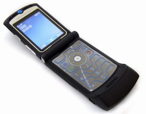
Motorola RAZR V3 Black : Buy it now
Sony Ericsson Xperia Pureness
Introduction
The Sony Ericsson Xperia Pureness of 2009 is among the most unique and interesting mobile phones of its era. The minimalistic design of this cell phone and its transparent display made a daring statement in the mobile world. The unusual characteristics and futuristic looks of the Xperia Pureness intended to infuse new life into the very concept of mobile technology. This exhaustive review aims to dissect everything about the Sony Ericsson Xperia Pureness-from design to display technology to performance to user experience and eventual legacy.
Design and Build Quality
1. Aesthetic Appeal
The Sony Ericsson Xperia Pureness distinguishes itself with an unprecedented kind of design. First impression will gerb at the transparent display of the phone, which was truly a design ahead of its time. The phone’s body is crafted from glass and stainless steel, providing a svelte and luxurious touch.
The transparent display forms the heart of the Xperia Pureness, showing off a simplistic design through which one can basically look. The phone’s display almost fades away into its background when not in use. This concept in design was a powerful statement, both crisply visual and functional, of Sony Ericsson pushing the boundaries of mobile technology.
2. Materials and Construction
The Xperia Pureness is prepared from the finest materials, endowing it with an expensive feel. The front is a single tempered glass that balances ruggedness with a smooth, polished surface. On the other hand, the back takes the credits for a brushed stainless steel finish, giving it a bit of class towards its brawny feel.
The transparent display uses a special kind of glass that promotes durability and adds a visual punch to the design. This material was chosen mainly to support the modern look of the handset while resisting impact from daily use. The Xperia Pureness stands in the top shelf of construction by Sony Ericsson on quality and design excellence.
3. Ergonomics and Comfort
Although rare, the phone is crafted with ergonomics in mind. Having a slim profile of 107 x 45 x 13.8 mm (4.2 x 1.8 x 0.5 inches), the phone is comfortable to hold and carry. The smooth, rounded corner edges of the handset further complement nice hand-grip feeling, and it is also lightweight.
The transparent display does not affect its usability while it resonates when visible. Leaning toward minimalism, the phone is designed to be simple and straightforward with its core features and functions. The Xperia Pureness creates a unique tactile sensation-vis-a-vis glassiness-which differentiates it from more currently available handsets.
Display and User Interface
1. Transparent Display Technology
People always listed as a selling point for the Sony Ericsson Xperia Pureness that it had a kind of transparent display thing, you know. The phone came with a TFT screen, 2.0 inches diagonally, 240 x 432 pixels resolution and it managed to render nice visuals. With that transparency actually, users could see the minimalist interface plus the notifications right through the screen, instead of them feeling hidden behind the glass, it was sorta the whole idea.
This display technology was one of the major innovations of its time, offering a new-once-and-for-all approach to how mobile phones could be designed. The transparency of the display offers an unparalleled aesthetic where the phone disappears into the background when not being used.
2. The Display Quality
While the transparent view of the Pureness does show a kind of refined elegance , it also feels, slightly underwhelming overall, because the display quality is rather modest compared to what today’s devices usually deliver. The resolution on this transparent display sits at 240 x 432 pixels , so it provides enough sharpness for basic things like reading text messages, and checking call details. That said, it stays kind of limited when it comes to color reproduction and brightness strength , and that limitation can, in turn , change the way everything looks during use.
But that is all on purpose: the transparent display exists primarily to showcase atmospheric beauty over really heavy-duty display performance. The interface of the phone was supposed to be intuitively functional and aesthetically pleasing, given the limits of transparent screen technology.
3. User Interface
Sony Ericsson has a customized user interface for the Xperia Pureness device using a transparent display. The user interface is kept minimal, keeping in mind that the user needs only a few rudimentary functions and information and should not be confused by dozens of choices. Main menu icons are lined up, accessible via the transparent display.
The interface stresses ease and clarity, much like the phone itself. The transparent display allows for a clear unobtrusive presentation of information, where notifications and menus simply appear on the screen. The UI is designed so that it coexists with the uniqueness of the display technology to provide an intuitive experience for its users.
Performance and Functionality
1. Hardware Specifications
The Sony Ericsson Xperia Pureness is equipped with hardware appropriate to its unique design and functioning. The phone has a single-core processor as according to the norm for devices during its time. Hardware-wise, it has great specs for making voice calls, sending text messages, and a few multimedia capabilities.
Although capable of supporting multimedia functionalities, 1 GB internal memory is the only storage of the Xperia Pureness, storing contacts, messages, as well as a little multimedia content. It lacks an external memory option and multimedia service support, thus keeping the spotlight on its unique design and fundamental functionalities.
2. Battery Life
Battery life is an under-considered aging issue for any cell phone, and the Xperia Pureness comes through well here. The phone comes with a removable 950 mAh battery that offers a fair charge time worthy of the class of device. A user can expect a full day of use with standby time exceeding 24 hours on a single charge.
The power-efficient design of the phone, including the transparent display and the almost bare-bones wu-interface, would help in squeezing out more battery life. All in all, battery life is not great but fits into the lifestyle and philosophy for which this phone is meant.
3. Connectivity and Network Supports
The Sony-Ericsson Xperia Pureness supports GSM for network connectivity and can thus work with a wide range of mobile networks. The phone is meant for voice calls and text messaging, with the additional support of GPRS data service for rudimentary access to the internet.
The Xperia Pureness does not go for 3G, neither does it have Wi-Fi, all of which lessen its possibilities of internet compared to much-enhanced devices. Indeed, the connectivity options of this phone are geared toward just carrying out essential and fundamental functions required of it instead of venturing into advanced data services.
Camera Performance
1. Camera Specifications
The phone’s camera is a 2-Megapixel one from a more modern perspective-it is really a basic lens. Its primary functions include taking still photographs and recording video clips. The interface which supports the camera is relatively simple, and the settings available for adjustment include brightness and contrast only.
This 2-Megapixel camera can manage only casual photography and shooting everyday life moments. However, without advanced features such as autofocus or optical zoom, the camera is very limited in both use and quality.
2. Image Quality
With respect to the photographic performances that a 2-Megapixel camera on a feature phone would expect in those days, the Xperia Pureness performed satisfactorily. The iPhone took fairly decent shots in good lighting conditions, and contrasts could glare with a little sunlight here and there. Given the stark contrast, the Pureness cannot handle lab-induced low-light conditions-the pictures turn out to be horrible.
It can shoot a movie, as long as it is just a casual clip, yet the quality of the phone-camera-software-model makes its quality pretty much worthless!-just as compared to recent smartphones being fully high-def recordings.
User Experience
Ease of Use
The objective has been to provide a unique experience focusing on simplicity and minimalist aspects with the Xperia Pureness. The transparent display and the easy-to-learn interface provide a one-of-a-kind approach to interacting with the device.
The phone is designed basically for ease of use: the simple and clear interface allows the user to access the basic functionality parametrically. The transparent display thus further extolls the user experience with a clean and minimal view of information and notifications.
Software and Applications
The Xperia Pureness runs on a proprietary operating system variant tailored to fit the phone’s transparent display. The software provides essential applications: web browser, email client, and media player. Apart from that, due to hardware restrictions and limited connectivity features, it lacks the capabilities of a modern smartphone.
The software has been optimized to fit the phone’s one-of-the-kind display technology for pleasant smoothness and responsiveness. The user interface design complements the transparent display with aesthetically pleasing effects and animations to heighten the overall application experience.
3. Multimedia and Entertainment
The Sony Ericsson Xperia Pureness provides users with the usual multimedia and entertainment offerings. It includes a media player for playing both music and video. The phone supports a wide array of file formats so users may go anytime to listen or watch their favorite media content.
The transparent display offers a very different experience to view and interact with multimedia content. As far as multimedia repertoire goes, the Xperia Pureness stands significantly limited when measured with modern smartphones, but the coolness factor attached to design and the fine mechanics of truly implementable utility gives it a very special appeal.
Market Reception and Legacy
1. Initial Reception
Discreetly launched as a luxurious feature phone for those who appreciated cool designs and bleeding technology, the phone was furiously spotlighted with its transparent display and minimalist design, which set it far away from the beaten path.
The Xperia Pureness won admiration for its daring design and peculiar features but was condemned for being a hush-hush high-priced affair with very few functionalities. The transparent display was hailed as a technological coup while on the flip, for many users, the limited highly advanced features and connectivity options were simply not justifiable.
2. Competitive Landscape
During the launch of the Xperia Pureness, they competed with a myriad of feature phones and early smartphones, such as those from the likes of Nokia, Apple, and Samsung. While the functionalities provided by these phones were more or less similar, the Xperia Pureness distinguished itself with its unique form and transparent screen amongst a sea of copies.
This innovative design of the phone offered a give-and-take deal of sorts with minimalism as the focal proposition in an era when the entire domain was dominated by conventional designs. Designers caught the world and entered the mobile phone market landscape with design-first inspiration rather than technical similitude.
3. Longevity and Impact
The Sony Ericsson Xperia Pureness was an attempt at commercialism. However, one thing which cannot be understated- it changed the design movement of mobile. The transparent display and simplicity-themed approach of the phone carried on to influence later designs and concepts. It was a wake-up call to many, highlighting the potential that unique representations hold toward mobile technology, a path which recent days have traveled much farther down.
Xperia Pureness stands for the path of innovation and courageous design. Its legacy can be seen in some ways, ranging from the transparent display technology development in other devices to the more general trend of aesthetic innovation in tech products. The Xperia Pureness proved that consumers were willing and ready for new and off-beat design directions, thereby opening the floodgates to further explorations in mobile design.
Technical Specifications
The Sony Ericsson Xperia Pureness technical specifications will be given in further details:
Dimensions: 107 x 45 x 13.8 mm (4.2 x 1.8 x 0.5 inches)
Weight: 120 grams (4.2 ounces)
Display:
Main Display: 2.0 inches TFT, 240 x 432 pixels, transparent
Processor: Single-core processor
Storage: 1 GB of internal storage
Battery: Removable 950 mAh Li-ion battery
Camera: 2 MP, 1600 x 1200 pixels
Connectivity: GSM 850 / 900 / 1800 / 1900, GPRS
Multimedia: MP3/AAC player, video recording
Operating System: Customized Sony Ericsson OS
Additional Features: SMS, MMS, email, web browser
User Feedback and Reviews
1. Positive Feedback
The Sony Ericsson Xperia Pureness was appreciated for its unique design and futuristic approach. Buyers found it to be an eye-candy phone with its use of transparent display cell technology. Minimalistic design and premium material choice were SelectKey to being a luxury item for those who cherish design equally with functionality.
Many users enjoyed the different tactile experience offered by the transparent display. The slick design offered case-worthy grip and yet another great aspect enhancing the overall user experience. The Xperia Pureness was also often a conversation starter, as the unfamiliar design caught the attention and admiration of many.
2. Criticisms
The Xperia Pureness opened itself up to some critiques amidst all its strengths. The phone’s capability was put down with respect to other devices available at the time. Apart from it being expensive, the lack of provision for 3G, Wi-Fi, and advanced multimedia features was seen as drawbacks.
The transparent display had its charm, but yeah it also came with problems like readability and contrast, kinda. A few users said the transparency sometimes made things harder to see, especially when there was bright lighting, like sun and all. Then the 2-megapixel camera on the phone was pretty basic, and for image quality it really couldnt match other models that were competing, not even close.
Conclusion
Sony Ericsson Xperia Pureness is another landmark in the innovation of mobile phones in terms of radical design and innovative use of transparent display. That approach to mobile design set it apart from any other designs available in the market during its release period.
Due to the very Indian concepts of minimalism and aesthetics, the Xperia Pureness indirectly proved that mobiles were more than just communication tools; they could also be expressions of personal style and modernism. The transparent display balanced with premium materials, thus, marketed the phone as a designer luxury product-an appeal for the conspicuous consumer who values design and exclusivity.
While the Xperia Pureness may not have become a commercial hit, it undoubtedly had its say on mobile design and impacted it instead. It went on to impact future devices and also demonstrated one of the many ways that a mobile device can integrate design language fairly uniquely. The legacy of this device is reflected in the pursuit of transparent display technology that persists to this day and the wider trend of drawing artistic experimentation into tech products.
In short, then, the Sony Ericsson Xperia Pureness contains the history of design innovation and creativity within the cell phone industry. The uniquely different qualities and design concepts pioneered by this phone make it one-of-a-kind and unforgettable, standing as an illustration of how technology and art may unite to create a unique concept.
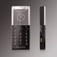
SONY ERICSSON XPERIA PURENESS X5 2GB BLACK FACTORY UNLOCKED 3G 2G GSM CELL PHONE: Buy it now
Related Posts


Tech Reviewer & Product Analyst
Định Bia has spent over 10 years testing consumer electronics with a focus on smart technology. He work as a product advisor at Biareview where he helped customers find the right devices for their needs. He personally tests every product featured on this site using a consistent evaluation framework covering quality, durability, and value. All reviews are based on experience, not influenced by the manufacturer.